
Cadmium Orange: The First True Orange and Why It Makes Skin Glow

PO20 is the pigment hiding in your flesh tones, your shadow passages, and your portrait's most convincing warmth - here is what it actually does in oil.
The orange you did not know you were missing
People treat cadmium orange as a specialty color - something you pull out for sunsets or bowls of tangerines. The assumption is that orange lives at the edge of the palette, and that a careful portrait painter probably does not need it.
That is almost exactly backwards. Cadmium orange is one of the most useful pigments in a naturalistic portrait palette, not because skin is orange, but because the warmth in lit flesh - that glow in the ear, the nose, the forehead - reads convincingly on canvas through a pigment that behaves the way light itself behaves: it shifts in both value and chroma as you lighten it. Once you understand that, you stop treating cadmium orange as a novelty and start treating it as a structural color.
The carousel says "you'll spot the orange in every ear now." That is not a teaser. It is a perceptual fact.
What cadmium orange actually is
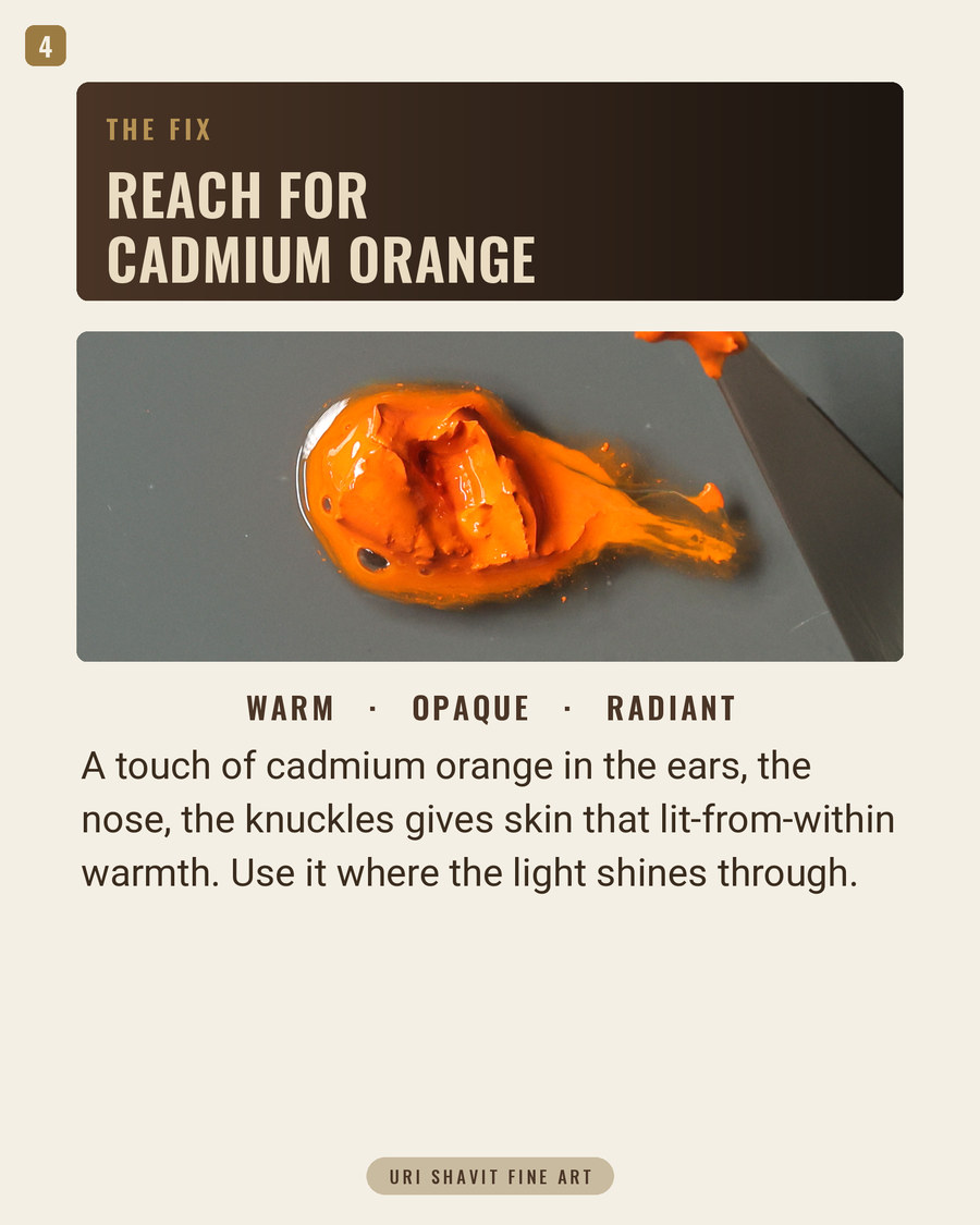
Cadmium orange's Color Index name is Pigment Orange 20, or PO20. It is a cadmium zinc sulfoselenide - the orange range of the cadmium family is produced by co-precipitating cadmium sulfide and selenide sulfide together, then calcining the mixture at high temperature. The more selenium substituted into the lattice, the deeper the color shifts: a small amount gives you cadmium yellow deep, pushing toward 12% selenium yields true orange, and continue further and you arrive at Pigment Red 108, cadmium red. The whole family is essentially one material tuned across a spectrum by a single variable.
In oil, cadmium orange is fully opaque with very high tinting strength. It takes up approximately 22 grams of linseed oil per 100 grams of pigment - relatively low oil absorption for an orange - which means it comes out of the tube with a workable consistency and does not demand excessive medium. Its drying speed is moderate. Lightfastness is ASTM Category I, meaning it is among the most durable orange pigments commercially available.
The behavior that matters most for painting is the gray-down in tints. Add white and cadmium orange loses both value and chroma together. This is characteristic of mineral pigments and it is the opposite of what most modern organic oranges do. I will come back to why this matters practically.
Where it came from - and what painters used before it
Cadmium orange is a strictly modern pigment. The element cadmium was discovered in 1817, commercial cadmium pigments arrived around 1840, and the sulfoselenide range - the orange and red cadmiums - was not developed until the second half of the 19th century. By 1880, chemists had established that increasing selenium content shifted cadmium yellow progressively through orange and into red. The pigment was not available in significant commercial quantities until the twentieth century, when cadmium became a by-product of zinc refining and the price dropped.
Before it existed, painters had no safe, stable, pure orange. Minium, or red lead, offered only fair stability. Realgar, an arsenic sulfide, was the closest thing to a pure orange mineral - Titian used it for orange drapery, Dutch flower painters such as Rachel Ruysch reached for it in vibrant petal passages - but it is highly toxic and incompatible with lead and copper pigments. Orpiment, the yellow-orange arsenic trisulfide, produces noxious fumes when heated and reacts with almost everything. Chrome orange, a lead chromate introduced around 1809, predated cadmium orange but darkens over time and carries lead. None of these are choices you would make freely. Gamblin's description is historically fair: cadmium orange is "the first true orange."
The failure modes
Mixing with lead or copper pigments. Cadmium orange contains sulfide, and sulfide reacts with lead and copper compounds to form dark, insoluble sulfides. Flake white, lead white, traditional Naples yellow, chrome yellow, minium, verdigris, and emerald green are all incompatible. The darkening can happen between layers as well as within a single mix. If you have a lead white underpainting and cadmium orange on top, you are setting up a reaction that may not show immediately but will develop over time. Use titanium white or zinc white alongside cadmium orange, not lead white.
Trusting a hue tube to behave like the real pigment. Cadmium orange hue tubes use organic pigment blends to approximate the mass-tone color. At full strength they can look nearly identical. But the moment you add white, the behavior diverges. Genuine PO20 grays down as you lighten it - losing chroma and value together. A hue made from modern organic pigments retains its chroma in tints, giving you bright pastel oranges instead of muted, naturalistic transitions. If you paint across multiple sessions and switch between genuine and hue without realizing it, your tint mixes will be inconsistent in a way that is genuinely difficult to diagnose.
Using it in fresco or exposed mural work. In oil paint, the vehicle encapsulates the pigment and protects it from air. In fresco, or any mural technique where the binder does not form a sealed film, cadmium slowly forms carbonate salts and will fade. Cadmium orange's excellent lightfastness rating applies to oil. In fresco, it is the wrong choice.
The three mixes that matter
Cadmium orange plus ultramarine blue for naturalistic neutrals. These two are near-complements - both opaque, both high tinting strength - and they produce muted, earthy browns and near-neutrals when combined. The colored grays that result are exactly right for shadow passages in portrait work and for landscape shadow that reads as warm-inflected rather than inert. Adjust the ratio to move between warm brown and cool gray. This is the dynamic Van Gogh described when he wrote "there is no orange without blue" - the contrast works in juxtaposition, and the mixture works as a neutral.
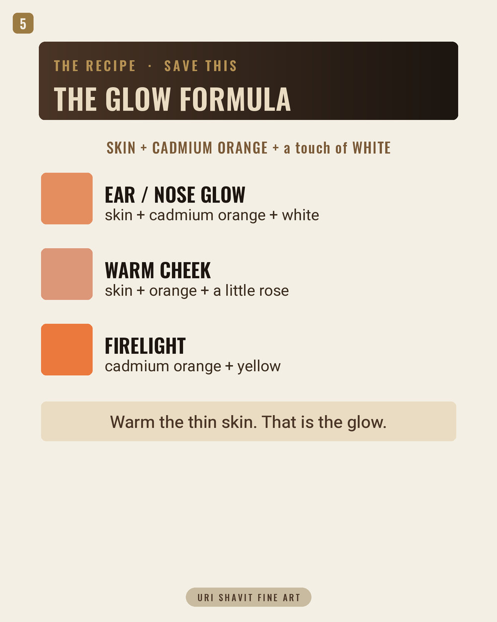
Cadmium orange plus titanium white for flesh transitions. Add white and watch the saturation drop as the value rises. A small amount of cadmium orange in a titanium white base produces a warm, muted salmon that reads as sunlit flesh without looking cosmetic. Push more cadmium orange in and the mix darkens and warms toward the shadow transition. The gray-down is not a flaw - it is why this pigment works for skin.
Cadmium orange plus Hansa yellow for clean warm secondaries. When you want to push toward a bright yellow-orange or mix into greens without muddying, adding a modern organic yellow such as Hansa yellow medium alongside cadmium orange gives you a cleaner secondary than mixing cadmium-to-cadmium. The organic yellow's chroma punches through, and the cadmium orange anchors the mix with body and opacity. Useful in landscape passages where you need sunlit warm-green or ripe wheat without the mix going flat.
The honest caveat
Cadmium orange will not give you a high-chroma pastel tint. The gray-down that makes it ideal for naturalistic flesh and light means that if you need a clean, bright, saturated apricot in a pale value, genuine PO20 is not the right tool. Pyrrole orange or a cadmium orange hue will serve that specific need. For everything described in this post, the genuine mineral pigment earns its place.
Also check your tube before you buy. "Cadmium orange hue" and "cadmium orange" look nearly identical on the shelf. Look for PO20 on the pigment line of the label. If it reads PO20, you have the real thing.
What to do now
Pull cadmium orange out and mix it against titanium white in a slow gradient from pure pigment to near-white. Watch where the chroma drops. That gray-down point - where the mix shifts from warm and saturated to warm and muted - is the most useful value on that scale for lit skin. Then take the same starting point and neutralize it against ultramarine blue to get a range of warm browns. Those two exercises will teach you more about what this pigment actually does in oil than anything I have written here.
Get the free skin tone cheat sheet. Every mix in this article on one printable page, sent straight to your inbox.
Visit the Color Mixing Book Library for the three books this all comes out of.


Comments