
Dioxazine Violet: The Shadow Pigment That Will Eat Your Whole Painting

PV23 is the most powerful pigment on the palette - one knife-tip too many and every color you mixed becomes its background.
The shadow is not gray
People say shadows are gray. Sometimes they say they are brown. Both answers miss something important. In warm natural light, the shadow is almost always the coolest thing on a surface, and cool in painting means leaning toward blue or violet. Painters who understand this stop mixing dead gray into their darks and start reaching for something with a slight temperature. Then they discover dioxazine violet, load a normal knife-amount onto the palette, and watch it eat everything else in the mixture.
That is the real story of this pigment. Not a mystery, not a secret of the masters - PV23 is a strictly 20th-century invention and no Old Master ever touched it. The story is about how an extremely modern and extremely powerful pigment fits into a shadow passage without destroying it. If you have ever wondered why your shadows keep going muddy purple, or why adding just a little violet turns into adding a lot, this is the post for you.
What dioxazine violet actually is
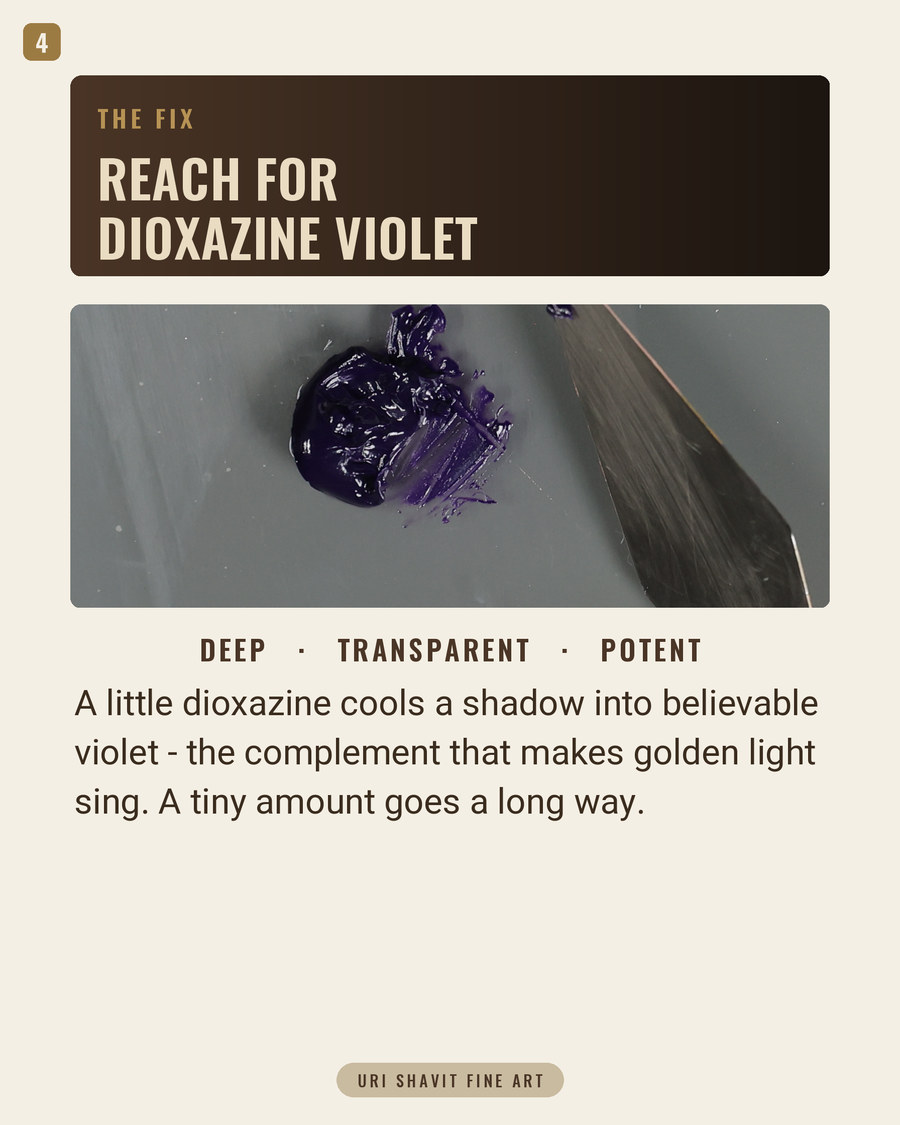
Dioxazine violet's Color Index name is Pigment Violet 23, CI 51319. You may also see it listed on tubes as Hostaperm Violet RL or Permanentviolett RL. Chemically it is derived from carbazoles and belongs to the dioxazine family of heterocyclic compounds, prepared by the condensation of chloranil and 3-amino-N-ethylcarbazole. PV23 is milled to ultra-fine particle sizes, typically below 0.5 micrometres, which is what gives it maximum tinting strength, full transparency in oil, and a deep saturated hue. On Gamblin's chart it registers as the strongest tinting pigment and the most fully transparent of anything on that palette. Some painters use it as a substitute for black. I will explain shortly why that is a trap.
Its color temperature is cool, sitting close to true central violet in color space and leaning slightly blue rather than red. ASTM lightfastness is Category I - the highest rating available. One honest note: the ASTM standard for organic pigments has been under revision since 2019, and some pigments previously rated Category I have failed re-testing under updated outdoor conditions. The rating on your tube label may reflect the old method. Treat it as a strong indication rather than a guarantee until manufacturers re-test their specific formulations.
One more thing to check at the shop: there is a related but distinct pigment, PV37 (CI 51345), sold by at least one supplier under the name "Dioxazine Violet." It is also a dioxazine-family compound with similar lightfastness, but it is not PV23 and the two behave differently. Check the pigment code on the label before you buy.
The historical thread
PV23 was first marketed commercially in 1952 by Hoechst AG under the name Permanentviolett RL. That date is the single most important historical fact about this pigment: no painter born before the mid-20th century ever used it. Monet did not use it. Van Gogh did not. Cézanne certainly did not.
Before PV23, artists had almost no reliable intense violet pigment at all. Violet appears in only 2-4% of artworks created before the early 1860s, rising to 36-47% after that date - a shift that coincides directly with the arrival of the first synthetic violets. Cobalt violet was prepared by Salvètat in 1859: chemically stable but expensive and weak in tinting power. Manganese violet (PV16) followed in 1866 and was commercially introduced in 1890 by Winsor and Newton. The Impressionists seized on it. Monet reportedly described violet as "the true color of the atmosphere" and used manganese violet extensively in his Rouen Cathedral series of 1892-1894, his most systematic investigation of violet-inflected shadow in light. Critics, not entirely approvingly, coined the term Violettomania to describe the movement's new cool shadows.
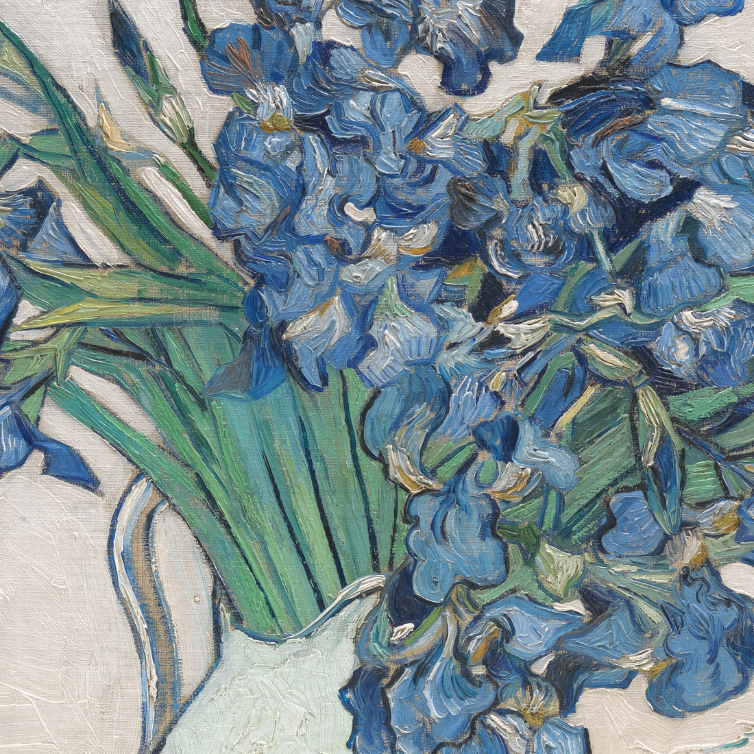
Manganese violet was the closest the Impressionists had to PV23. But it has low tinting strength compared to PV23, meaning a painter of the 1890s could load a full knife and stay in control. With PV23, the same gesture destroys the mixture. That gap in tinting power is the entire practical story of this pigment.
The failure modes
Overdosing. PV23 has the strongest tinting strength of anything on the palette. A normal knife-load - the amount you might scoop up for any other color - immediately contaminates an entire mixture with an unintended violet cast. Gamblin says "use sparingly" and treats this as the primary hazard in their own product notes. The fix is to treat PV23 like a staining dye: start with a knife-tip, far less than you think you need, and build from there. Once a violet cast is in, you cannot unmix it.
Mistaking it for black. Straight from the tube, PV23 reads as near-black. It does produce a deep rich dark, but it is a cool violet-inflected dark, not a neutral one. In warm ambient light, those shadows will read purple. If you need a neutral dark, use a neutral dark. Reserve PV23 for situations where you specifically want that cool violet note, and use it at knife-tip scale.
Expecting it to behave like a mineral violet in white mixtures. Cobalt violet mixed with white grays down considerably, producing a soft naturalistic muted tint that works beautifully in flesh shadow passages. PV23 does the opposite: it stays cold and intensely chromatic even in high-key tints. Gamblin explicitly describes the result as "cold intense." A painter who reaches for it expecting the quiet grayed mauve of a cobalt violet will get a garish saturated mauve instead. When a muted tint is what you need, reach for cobalt or manganese violet. Save PV23 for situations where a high-chroma cool violet is genuinely wanted.
The three mixes that matter
A transparent cool shadow glaze. PV23 thinned with a touch of oil medium and laid over a dried warm earth passage. Because PV23 is fully transparent, it cools and deepens the warm tone underneath without covering it - the warm under-color remains visible through the violet. That is the layered warmth-against-cool that creates the sensation of depth in a shadow. A knife-tip of PV23 goes a long way in a glaze medium; begin small and repeat rather than trying to hit the value in one pass.
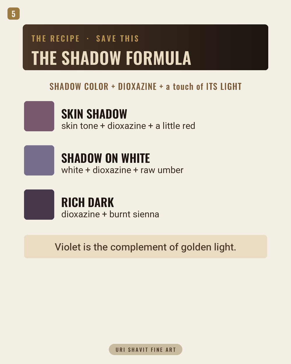
Warming toward violet with Quinacridone Red. Raw PV23 sits at cool, blue-leaning violet. If you want a warmer, redder violet - the kind that reads as a shadow on warm skin rather than a winter sky note - add a small amount of Quinacridone Red and work toward the red-violet range. Gamblin specifically recommends this combination. The result is still high-chroma, so restraint still applies, but the temperature shift makes integration into flesh and figure passages much easier.
Cooling an earth tone with a knife-tip accent. Gamblin demonstrates this directly: a tiny measure of PV23 added to Transparent Earth Red shifts it toward a cooler register - the example sits alongside Alizarin Permanent in their notes, meaning even a knife-tip is enough. The lesson transfers to any warm earth mixture that needs nudging toward shadow without going gray. Mix your earth tone to the right value first, then introduce PV23 one knife-tip at a time, checking between each addition. The goal is a shadow distinctly cooler than the light without going visibly purple.
The honest caveat
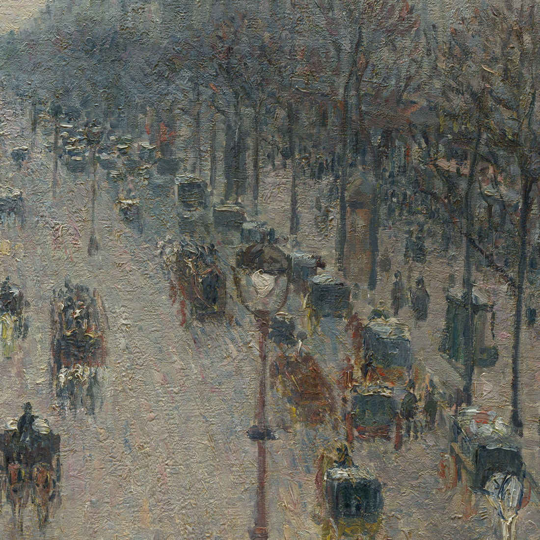
PV23 will not give you a soft, naturalistic, muted violet. That is simply not what this pigment does. Painters who want the quiet grayed shadow of Pissarro's winter boulevards need cobalt or manganese violet for that job - a cool tint that grays down and whispers rather than shouts.
Check the tube label before you buy: some manufacturers sell a "Dioxazine Purple Hue" formulated with other pigments to approximate the color. The genuine pigment is PV23. A hue formulation may behave very differently in tinting strength and transparency. And drying time and oil absorption figures for PV23 are things I cannot give you with confidence - the sources I have do not supply comparative numbers, and I would rather say that plainly than give you a figure I cannot stand behind.
What to do now
Put a single knife-tip of PV23 into a small pile of Transparent Earth Red and mix it completely before you add any more. Look at what one knife-tip does to that warm tone. Then put the same knife-tip into a pile of Titanium White and look at how cold and intensely saturated the tint stays. Those two experiments, done on the palette before you touch a canvas, will teach you more about this pigment than any amount of reading.
Get the free skin tone cheat sheet. Every mix in this article on one printable page, sent straight to your inbox.
Visit the Color Mixing Book Library for the three books this all comes out of.


Comments