
Naples Yellow: The Warm Light You Reach for Before White

Why soft light on skin is a warm cream - not white - and how a 3,500-year-old pigment does that job better than anything else on your palette.
The White Reflex
People say: when the light on skin gets soft and creamy, reach for white. Add a little, push the value up. The result is always the same - a chalky, cool passage that reads as overcast rather than warm. The skin stops glowing and starts looking like it was photographed under a fluorescent light.
The problem is not your white. The problem is that soft light on skin is not a lighter version of the local color. It is a warmer, slightly more muted, more opaque passage. That is a different job, and it calls for a different pigment. Naples yellow exists precisely for that job - and it has been doing it for roughly 3,500 years.
What Naples Yellow Actually Is
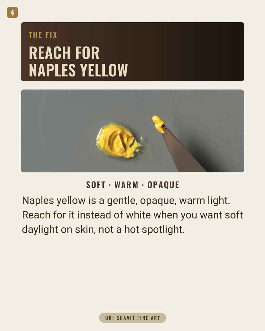
Genuine Naples yellow is lead(II) antimonate, formula Pb2Sb2O7, Color Index Pigment Yellow 41 (PY41). It is not a pale yellow and not a tinted white. In the tube it reads as a warm, earthy reddish-yellow - sometimes with a faint greenish or pinkish tinge - and it has the dense, buttery opacity of a lead pigment.
A few numbers that matter to how it paints. Its oil absorption is only 18 grams of oil per 100 grams of pigment - one of the lowest figures on any yellow. Low oil absorption means fast drying and a paint film that does not shrink much. Tinting strength is medium: it will not overwhelm a mix the way cadmium yellow does, which is part of why it blends so naturally into flesh.
One handling note. When genuine PY41 is ground in standard alkali-refined or raw linseed oil it tends to produce a long, stringy paint. Walnut or safflower oil gives a considerably better result. If you grind your own, choose walnut oil. Lightfastness is good according to independent studies, but ASTM International has not formally rated it, so I will not give you a category number that is not confirmed.
A History Worth Knowing
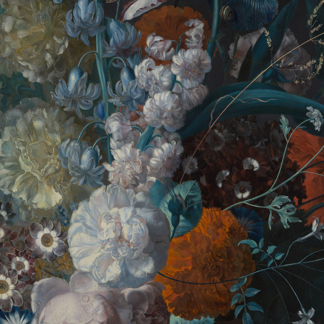
Naples yellow is one of the oldest known synthetic pigments, manufactured as early as the 18th Dynasty at Thebes - between the 16th and 14th century BCE. It has been identified in Egyptian, Mesopotamian, Babylonian, Greek, Roman, and Celtic objects. For most of that time it lived in glass, ceramic glazes, and enamels. Its first published recipe as a ceramic color appeared in Piccolpasso's Le Tre Libri dell'Arte del Vasaio in 1556. In European oil painting it arrives around 1600; the earliest analytically confirmed use in a painted work is in Matthias Stom's Arrest of Christ (c.1633-1639), in the torchlit drapery figures. The name luteolum napolitanum was coined by Andrea Pozzo in a fresco treatise published in Rome between 1693 and 1700.
Here is the piece of history that most guides get wrong. When people discuss "Naples yellow in Rembrandt" or "Naples yellow in Vermeer," they are almost always describing a different pigment: lead-tin yellow, known as giallolino. That was the dominant warm opaque yellow for European painters from around 1300. Titian used it, Raphael used it, Rembrandt used it, Vermeer used it - then it virtually vanished around 1750 and was only rediscovered scientifically in 1941 by Richard Jacobi at the Doerner Institut using X-ray diffraction. Any warm opaque yellow highlight you admire in a 17th-century Dutch painting is almost certainly lead-tin yellow, not Naples yellow.
Naples yellow came into its own between roughly 1750 and 1850, used by Mengs, Goya, David, Ingres, Delacroix, and Cézanne. After 1850 it was displaced by chrome yellow and then cadmium yellow, and the name "Naples yellow" began to mean almost anything warm and pale.
The Failure Modes
Buying a hue and treating it as the real pigment. Most tubes labelled "Naples Yellow" from mainstream brands contain no PY41. Gamblin's version, for example, is titanium dioxide, arylide yellow, and iron oxide - PW6, PY75, PY43. That is a perfectly honest hue formulation, but these substitutes are less opaque, dry more slowly, and have none of the fast-drying lead character. Check the Color Index codes on the tube. If you do not see PY41, you are not using Naples yellow.
Contact with iron. George Field warned that Naples yellow can turn black in the presence of iron. A steel palette knife is enough - abrasion deposits iron particles directly into the paint. Field advised an ivory or horn knife; a glass knife is the practical modern equivalent.
Sulfur exposure in thin or dilute layers. The lead component can convert to black lead sulfide on contact with atmospheric hydrogen sulfide. This risk is much lower in oil painting because the oil film acts as a barrier - but it rises sharply in dilute, lean layers where the lead is more exposed. Keep your paint layers reasonably full.
The Three Mixes That Matter
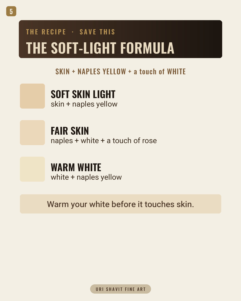
Naples yellow + lead white for soft light on skin. Replace some or all of your white in the light passages of skin with Naples yellow. The opacity of PY41 gives you covering power without the cool, chalky drift that titanium white introduces. The muted warmth of the pigment means the light stays warm even as it gets lighter. Start at roughly two parts Naples yellow to one part lead white and adjust from there. A small touch of violet pigment mixed into this base can add surprising vibrancy to the range.
Naples yellow + ivory black for half-tones and neutral grounds. Mixing Naples yellow with any black produces a relatively neutral, greenish-gray. In skin painting, a small amount dropped into the half-tone region gives you a neutralized transition that stops the half-tone from looking muddy or purple. It also makes an excellent mid-value neutral ground for portraits: warm enough to not read as cold, gray enough to not fight the skin tones laid on top.
Naples yellow + red for low-chroma warm orange. Where you need an orange in the warm mid-tones of skin or in a landscape - Venetian red or light red work well - Naples yellow gives you a lower-chroma orange than cadmium yellow and red would. The reduced saturation is a function of the pigment's earthy, muted character. That is not a weakness. It is exactly what you need when the warm color has to read as part of a coherent skin tone rather than a separate event.
The Honest Caveat
Naples yellow will not give you a high-chroma, saturated yellow. If you need a yellow that shouts - a sunflower, a primary yellow in a graphic composition - this is the wrong pigment. Its value is in the muted register, in opaque warmth, in light that stays warm without going garish.
If your tube says "Naples Yellow Hue," you are working with a different animal. The hue versions can be fine paints and their lightfastness is often better documented. But they dry differently, feel different on the brush, and the specific handling character of a low-oil-absorption lead pigment will not be there. Know which one you have before you build a technique around it.
Also: genuine PY41 contains lead and is rated a carcinogen and teratogen. Wash hands after use, do not sand dried paint containing it, and do not generate dust from it.
Go Find the Warm Light
Put your titanium white aside for one session. Mix your lightest skin passages from Naples yellow and lead white only. Then look at whether the light stays warm, whether the opacity reads as solid rather than chalky, and whether the half-tones that border it still make sense. That single experiment will tell you more than anything I can say here.
Get the free skin tone cheat sheet. Every mix in this article on one printable page, sent straight to your inbox.
Visit the Color Mixing Book Library for the three books this all comes out of.


Comments