
Phthalo Green: The Pigment That Eats Every Mix

One tube with the tinting strength of a dye, a history measured in decades not centuries, and three habits that separate the painters who use it from the painters it uses.
"Just a little" is never a little
People say phthalo green is a useful all-purpose green - that it mixes well with anything, covers every foliage need, and is a fine substitute for viridian when you run out. I want to push back on all three of those ideas, because they are exactly the assumptions that lead painters to ruin an entire mix with one careless knife-load.
Phthalo green is not an all-purpose green. It is a concentrate. Think of it less as a pigment you scoop and more as a dye you dilute. The carousel joke is that one tube is ruining every green you mix. That is not really a joke. It is a diagnosis.
What phthalo green actually is
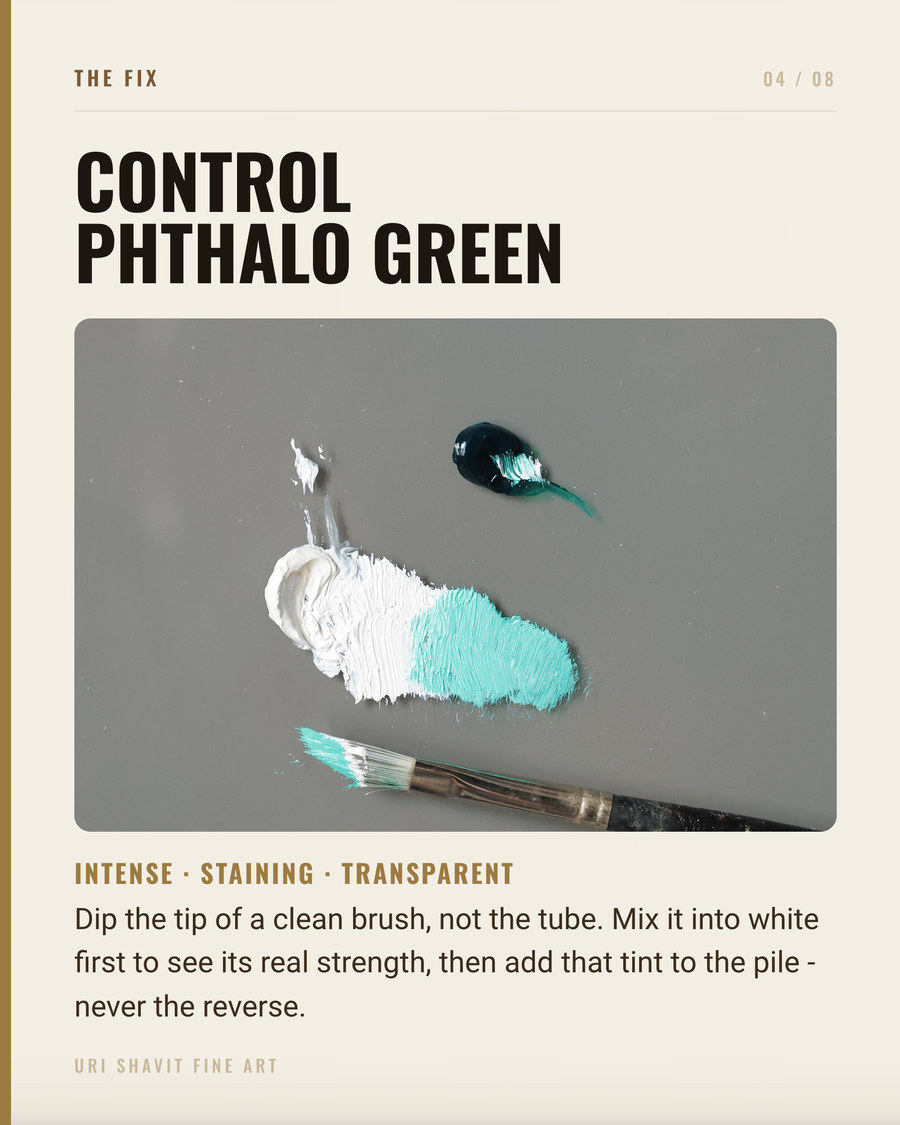
Phthalo green comes in two close relatives. PG7 (Pigment Green 7, C.I. 74260) is the original: a synthetic copper phthalocyanine carrying roughly fifteen chlorine atoms per molecule. The result is a cool, dark, transparent blue-green - aptly described as dark cyan, purer and darker than viridian, with a clear lean toward blue. PG36 (Pigment Green 36, C.I. 74265) replaces some of those chlorine atoms with bromine, which shifts the hue warmer and yellower. Gamblin calls it Phthalo Emerald. The two pigments bracket the green family the way a warm-cool pair brackets any other hue family on a spectral palette.
In oil, PG7 is fully transparent, chemically inert, and impervious to alkali, acids, solvents, heat, and ultraviolet radiation. Gamblin rates it Lightfastness I - the highest ASTM rating. Kremer rates both PG7 and PG36 at 8 out of 8 on their own scale, in thinned, medium, and concentrated form. What it does not do is sit quietly beside other pigments. Its particles are extremely fine - specific surface area of 53 m2/g - and they disperse with ferocious efficiency, penetrating any neighbouring color the moment they make contact. That single property explains everything else in this post.
One label warning before we go further: a tube marked "Viridian Hue" or "Phthalo Green Hue" often contains PG7 blended with titanium dioxide and arylide yellow. That tube is semi-opaque, will not glaze, and will mix differently in every recipe below. Check the pigment index on the back. The genuine single-pigment tube is always transparent.
Where it came from - and how recent it is
Phthalo green is strictly modern. Phthalocyanine blue was accidentally discovered in 1927, and the chlorinated green derivative (PG7) was first synthesised around 1935-1936. According to the Boston MFA's CAMEO database, it reached commercial sale in 1938. No painting made before approximately 1938-1940 can contain it.
That date matters. The historical greens available before it were a difficult set: malachite (basic copper carbonate, prone to turning brown), verdigris (which Cennino Cennini praised as "beautiful to the eye, but it does not last"), green earth (a dull silicate suited to underpaintings only), emerald green (copper acetoarsenite - vivid but poisonous), and viridian (hydrated chromium oxide, first manufactured around 1838). Giovanni Bellini worked with malachite; in his Agony in the Garden, now in the National Gallery in London, Saint James's cloak was originally painted green with malachite and has since darkened to near-black. Gainsborough avoided the problem entirely by mixing foliage from combinations of blue, yellow, brown, black, and white - the multi-pigment mixtures in Mr and Mrs Andrews (c. 1750) read as naturalistic precisely because no single saturated green was stable enough to rely on. Viridian eventually replaced emerald green from the late nineteenth century onward; phthalo green then supplanted viridian after 1938, driven by greater stability and lower cost.
The failure modes
Uncontrolled tinting strength. A quantity that looks modest on the knife will overpower any mixture containing white, an earth, or a cadmium before you have finished stirring. Mix phthalo green as if it were a dye: start with a trace, mix thoroughly, then decide whether you need a second trace. Adding yellow or earth to a blob of phthalo green is mixing in the wrong direction - you will spend the rest of the session trying to walk back a mistake.
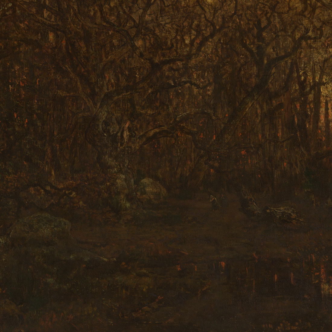
Reaching for PG7 when PG36 is the right choice. PG7 is a cool blue-green. Most greens in the natural world read warm and yellow. Corot's plein air studies from Fontainebleau sit in a warm golden-green range in the lights and a cooler gray-green in the shadows, but nothing reads as a cool, saturated blue-green. PG7 straight from the tube belongs to a different species of green from any passage in those paintings. For naturalistic foliage, PG36 - Phthalo Emerald, the warm yellow-green variant - is the better starting point.
Substituting it for viridian without adjusting quantities. Phthalo green is darker, purer, and more aggressive than viridian. A one-for-one swap in any recipe or landscape sketch will produce a mix that asserts itself in a way viridian never did. If you are switching from PG18 to PG7, start with roughly half the quantity you normally use and work up from there.
The three mixes that matter
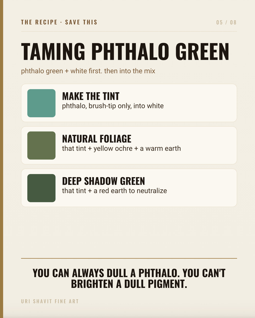
PG7 plus transparent red iron oxide for a rich, transparent near-black. Transparent red iron oxide is the approximate complement of phthalo green. In a roughly balanced ratio the two produce a deep, transparent near-black with far more luminosity than a black pigment gives. Gamblin specifically recommends this combination for verdaccio underpainting and earthy greens. More usefully, it substitutes cleanly for the bituminous browns Old Masters depended on - asphaltum, bitumen, Van Dyke brown - without the cracking and long-term darkening those materials bring. Rousseau solved a similar problem in his dark tree masses by mixing emerald green with organic browns; the phthalo-plus-transparent-red-oxide strategy reaches the same place with stable, permanent materials.
A trace of PG7 to boost a mineral green tint. When viridian or cobalt green mixed with white looks flat, a barely-visible quantity of PG7 raises the chroma noticeably. You are not making a phthalo green color; you are using its extreme tinting strength as a chroma amplifier. The mineral pigment does the visual work; the phthalo green simply lifts the tint's saturation without making it feel synthetic, because the quantity is so small.
PG36 plus Hansa yellow plus a touch of quinacridone red for naturalistic foliage. This is the mix I actually use in landscape work. PG36 provides the green foundation; a warm or cool Hansa yellow shifts it into the yellow-green range where real foliage lives; and a very small amount of quinacridone red or transparent red iron oxide brings the chroma down to the level you actually observe in a tree canopy under northern light. Starting with PG36 rather than PG7 puts you on the right side of the warm-cool divide before you add anything else. These three modern organics mix cleanly together; mixing phthalo green with cadmiums or earth ochres can produce slightly dull results because of differences in refractive index and particle size.
The honest caveat
Phthalo green will not give you naturalistic foliage if you use PG7 straight. The chroma at mid-values is far higher than almost any green found in nature, and the cool blue bias makes it look synthetic against warm sky or warm earth. The pigment is not broken - it was designed for coatings and inks where that saturation is a virtue - but in a representational painting it needs a partner to bring it to earth.
Also watch the tube label. If it reads anything other than PG7 or PG36 alone, you are not buying a single-pigment transparent phthalo green, and it will not behave like one.
Go and do this now
Put a small amount of PG7 on your palette. Mix the tiniest trace you can pick up on the knife tip into a pile of yellow ochre. Look at what happened. Then try twice the amount. What you see in those two tests is the whole lesson: the gap between "just a little" and "far too much" is narrower with phthalo green than with any other pigment you own. Once you have felt that on the knife, you know how to use it.
Get the free skin tone cheat sheet. Every mix in this article on one printable page, sent straight to your inbox.
Visit the Color Mixing Book Library for the three books this all comes out of.


Comments