
The Cleanest Way to Cool Skin

Four blues walk into a flesh mix. Only one comes out clean - and the reason explains half of portrait painting.
Look at a head in a raking light. The forehead comes at you warm, the cheekbone comes at you warm, the bridge of the nose is the warmest thing on the face. Then follow the cheek around toward the jaw, or up to the temple, or across the shaved plane in front of the ear - and the colour changes character. It cools. It drops very slightly toward blue.
Every portrait painter sees this. Most reach for a blue, mix a little into the skin, and watch the whole passage go gray, chalky and dead. Then they conclude that skin should not have blue in it after all.
The observation was right. The blue was wrong.
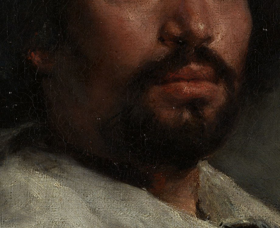
Why skin cools at the turn
Three things are happening at once on that turning plane, and they all push in the same direction.
First, the warm key light is falling off, so whatever ambient light is bouncing around the room - cooler, usually from a window or a wall - makes up a larger share of what you are seeing. Second, skin is translucent, and light that penetrates and scatters back out of a plane nearly edge-on to the source returns cooler than light bouncing off a plane facing it directly. Third, on a male sitter there is often literal blue-black hair sitting under a millimetre of translucent skin along the jaw.
The crucial thing about all three is that this is a temperature shift, not a value shift. The turning plane is barely darker than the lit plane. It is cooler. And it has to stay clean, because the moment that passage goes muddy the head stops rotating in space and flattens into a cut-out.
The four blues, and what each does to skin
This is the part nobody tells beginners. "Add blue to cool it" is useless advice, because the four common blues behave nothing like each other in a flesh mix.
Phthalo blue - Enormous tinting strength, transparent, green-leaning. Takes the mix over instantly. A speck turns flesh into cold gray-green. Effectively unusable in skin.
Ultramarine - High strength, transparent, violet-leaning. Cools well but drags the mix purple. Excellent in deep shadow, dirty and dull in a delicate halftone.
Cerulean - Moderate, very opaque, granular. Genuinely cool and clean, but chalky. It kills the transparency of the halftone and the skin turns pasty.
Cobalt - Moderate strength, semi-opaque, neutral hue. The quiet one. Cools the plane without dragging the hue anywhere. Stays fresh.
Why cobalt behaves itself
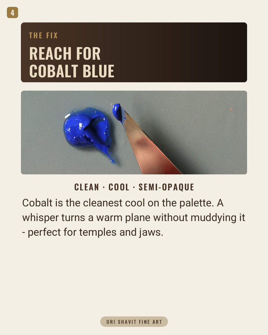
Cobalt blue is PB28, a cobalt aluminate, and it has an unusual combination of properties. It is a true neutral blue - it does not lean green the way phthalo does, and it does not lean violet the way ultramarine does. It is semi-opaque rather than fully transparent. And its tinting strength is moderate rather than overwhelming.
Those three facts together are why it works in skin. Because it is neutral, adding it moves the mix along the temperature axis without dragging the hue sideways into purple or green. Because its strength is moderate, you can add it in small increments and stop where you want instead of overshooting. Because it is semi-opaque, it cools a passage without either burying it or turning it to chalk.
The tube warning. Genuine cobalt is expensive, and most manufacturers also sell a cobalt blue hue - which is usually ultramarine and white, precisely the pigment whose behaviour you were trying to avoid. Look for PB28 on the barrel. Paying for the real thing is worth it here in a way it is not for many other pigments.
How the masters did it without cobalt
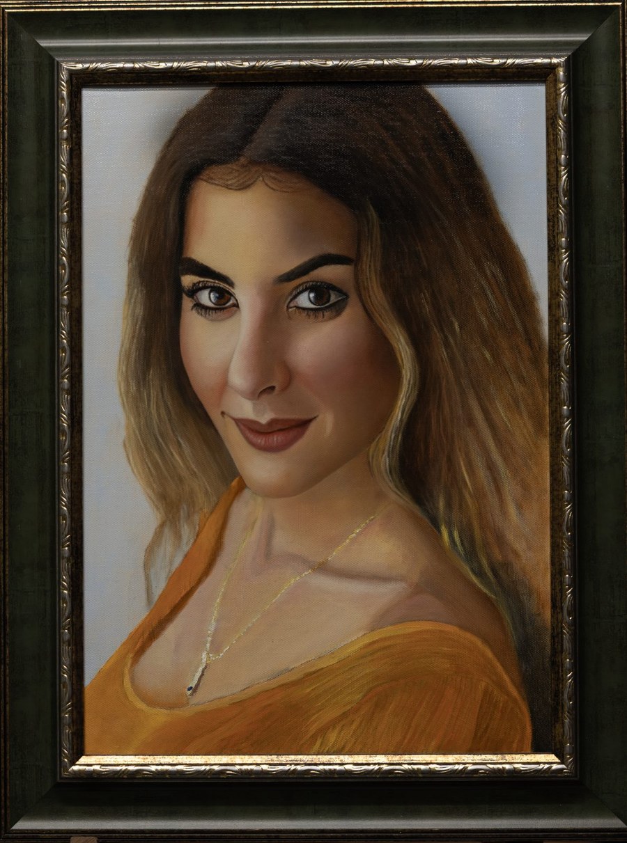
Worth being honest about the history: cobalt blue did not exist until Thenard synthesised it in 1802. Velazquez could not have used it. His palette for the portrait above was lead white, iron-oxide reds and yellows, vermilion, azurite and bone black - a deliberately short list - and every cool neutral in that jaw was mixed, not squeezed.
That is the encouraging part. The masters were not reaching for a special cooling pigment; they were building neutrals from what they had and placing them with enormous precision. Cobalt does not give you anything they lacked. It just makes the cleanest version of that neutral far easier to reach, which means you can spend your attention on where the cool goes rather than on fighting to keep it clean.
The three mixes that matter
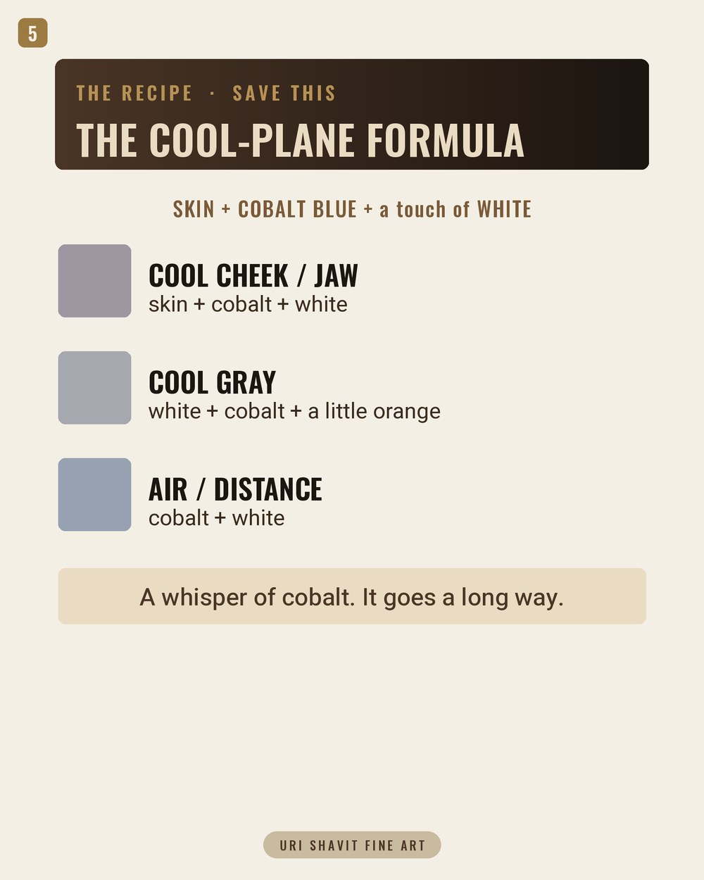
Cool cheek and jaw - skin + cobalt + white. Mix your normal flesh tone first and get it right, then introduce cobalt a whisper at a time. If you can see blue, you have gone too far. What you are looking for is the moment the mix stops reading as warm without yet reading as cool - that neutral hinge is where the plane turns.
Cool gray - white + cobalt + a little orange. The mix you will use most and think about least. A touch of orange knocks the blue back to a true neutral, and you end up with a gray that has temperature in it rather than a dead mixture of black and white. It is the correct background gray, the correct shirt-collar gray, and the correct base for almost any cool passage on the face.
Air and distance - cobalt + white. Straight, clean, no warmth. This is what goes behind the head and into anything meant to recede.
The mistake underneath the mistake
Most painters who have not solved this reach for gray or black to cool a plane, and it never works. Here is why: black lowers the value, it does not lower the temperature. Add black to a skin tone and you get a darker skin tone - still warm, now also muddy. The head goes flat, and the painter concludes they have a drawing problem.
Temperature and value are two separate dials on the same instrument, and most portrait trouble comes from turning the wrong one. Cobalt is the temperature dial. Raw umber and burnt umber are the value dials. Once you separate them in your head, a great deal of what looked like mysterious failure turns into an ordinary, fixable decision.
Temperature turns the form
This is the idea the rest of it hangs on. A head is, at bottom, a sphere. Every drawing course teaches you to turn a sphere with value - light on top, dark underneath, a reflected light at the bottom edge. Do that and only that and you get a convincing gray ball.
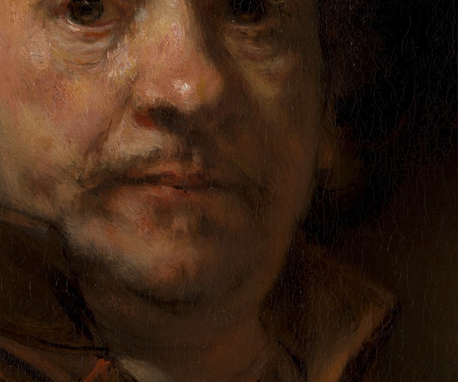
What makes a head read as living flesh rather than a sculpted object is that the light side is warm and the turn is cool. Temperature does roughly half the modelling work, and it is the half almost nobody is taught. Cobalt blue is the cleanest tool available for that half - which is why a tube of it justifies its price on a portrait palette in a way it might not on a landscape palette.
What cobalt mixes well with
With burnt sienna - the most useful neutral pair on the palette. A clean cool and a well-mannered warm earth that will give you every gray from warm to cold without either one bullying the other. If I could keep only two tubes past white, it would be these.
With yellow ochre - quiet greens for cloth and background, far more paintable than anything out of a green tube.
With white alone - the cleanest sky, and the best "air" behind a head.
With terre verte - a doubly cooled halftone. Effective, and very easy to take too far.
What to do with this
Take your next portrait and, before you touch it, find the three coolest planes on the face. Not the darkest - the coolest. Then mix them with cobalt and white rather than with black. In most cases that one substitution does more for the sense of a head turning in space than another week of drawing correction.
Get the free skin tone cheat sheet. The cool-plane formula and the rest of my portrait mixes, on one printable page. Sent straight to your inbox.
Keep reading: Why the old masters painted skin green first - How to mix skin colour with oil paint - The Munsell system for describing colour


Comments