
Ultramarine Blue Is Not Just a Blue - It Is an Argument Against Black

Why the most expensive pigment in history still earns its place on your palette, and the three mixes that prove it.
The Blue That Cost More Than Gold
People hear "use blue in your shadows" and think it is a stylistic choice - a moody habit picked up from the Impressionists. It is not. It is a structural decision about how light behaves. When you reach for black to darken a color, you are not painting a shadow; you are painting mud with a plausible location on the canvas. Ultramarine does something different. It deepens a color while keeping it alive. Understanding why starts with what the pigment actually is.
What Ultramarine Actually Is in Oil
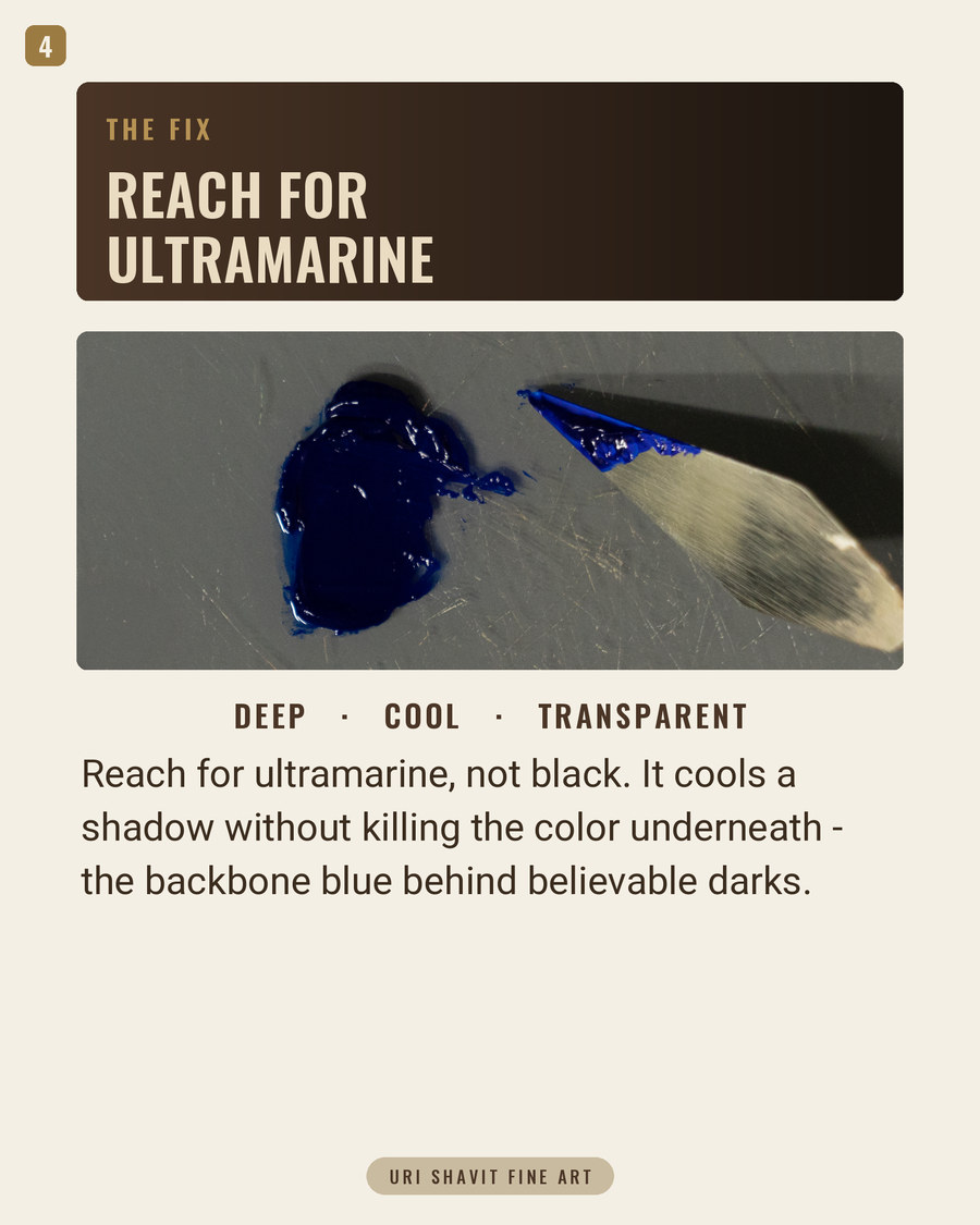
The Color Index designation is Pigment Blue 29, PB29, number 77007. Chemically it is a complex sulfur-containing sodium-silicate - the most chemically complex of all mineral pigments. The blue is caused by the S3 radical anion, the trisulfide, carrying an unpaired electron. That detail matters in practice: the color mechanism is genuinely unusual, which explains the pigment's unusual behavior on the palette.
In oil, ultramarine is transparent with moderate tinting strength - Gamblin lists it explicitly. Applied thick and opaque, it can look almost blackish. Applied thinly or as a glaze over a lighter passage, it opens up completely. It works best either blended with white for a luminous opaque tint, or used as a transparent glaze over a lighter underpainting. If you have been loading it on the palette knife and wondering why it goes dead and heavy, that is the reason.
Ultramarine is a warm blue with a red bias, so tints with white push toward lavender rather than a clear sky blue. Lightfastness is ASTM Category I - the highest rating. Historic natural ultramarine has been found in perfect preservation in paintings several centuries old. That part of the reputation is entirely earned. It is also a slow-drying color; plan your layering accordingly.
One note for painters who grind their own or add medium freely: ultramarine is hydrophilic, meaning it wets poorly in vegetable oils. Commercial manufacturers add aluminum stearate to stabilize the tube paint. If you add extra medium to an already-stearated tube color, you can upset that balance - more on this below.
The Historical Thread
Natural ultramarine was first documented in 6th-7th century AD wall paintings in the Bamiyan caves of Afghanistan, close to the Sar-i-Sang mine in Badakhshan - the source that supplied lapis lazuli to the world for millennia. The name comes from the Latin ultramarinus, "beyond the sea," because Italian traders brought the stone through Venice from Afghanistan into Europe.
The extraction process was laborious. Cennino Cennini described it in the 15th century: grind the stone, mix it into melted wax, resins, and oils, then knead the mass in water repeatedly. Each successive pass produced lower-quality blue. Albrecht Dürer paid the equivalent of 41 grams of gold for just 30 grams of it in 1508. Contracts for major commissions specified exactly where ultramarine could be used - principally the robe of the Virgin Mary, for painters including Titian, Raphael, Vermeer, and Michelangelo.

Before synthetic ultramarine existed, the workhorse blue in European painting was azurite - a basic copper carbonate that was cheaper but darkened and turned green with age. Smalt and indigo were used too, often as underlayers to reduce how much costly lapis was needed. The breakthrough arrived in 1814 when Tassaert noticed blue deposits forming in a lime kiln at Saint-Gobain. A prize of 6,000 francs for a synthetic process followed in 1824. Jean-Baptiste Guimet developed a method by 1826 and was awarded the prize in February 1828. By 1830 he was selling synthetic ultramarine at 400 francs per pound while natural lapis cost 3,000-5,000 francs per pound. The democratization was immediate. Van Gogh used French ultramarine and cobalt blue together in The Starry Night in 1889.
The synthetic PB29 you buy today is not a substitute for the "real thing." It is chemically identical to the lazurite compound in lapis lazuli, only more intense and more uniform. There is no historical original being approximated here - the tube already is the equivalent.
The Failure Modes
Ultramarine sickness. A grayish or yellowish-gray discoloration, sometimes patchy, observed in both historic and modern oil paintings. Contributing factors include atmospheric sulfur dioxide, moisture, and acidity of the oil or medium. It is not a lightfastness failure - the pigment itself is stable - it is a medium failure that the pigment's water-affinity worsens. Keep mediums lean and non-acidic.
Acid destruction. Ultramarine is extremely sensitive to even dilute mineral acids and acid vapors, which bleach it rapidly and release hydrogen sulfide. Acidic mediums, acidic supports, and outdoor applications are all off-limits. Do not use it in fresco where the lime is still active.
Oil overload and slump. Because the pigment wets poorly in oil, tube paint can feel stiff, then suddenly slump to a flowing, oil-rich paste when medium is added. An overly oil-rich film wrinkles, dries slowly, and cracks. The tube paint is already formulated to manage this; extra medium upsets the balance. Pure ultramarine films can also develop fine random cracks in humid conditions.
Zinc white incompatibility. Even a small addition of zinc oxide - especially to reddish shade variants - causes a visible and considerable reduction in color intensity. Test the combination on the palette before committing it to a painting.
The Three Mixes That Matter
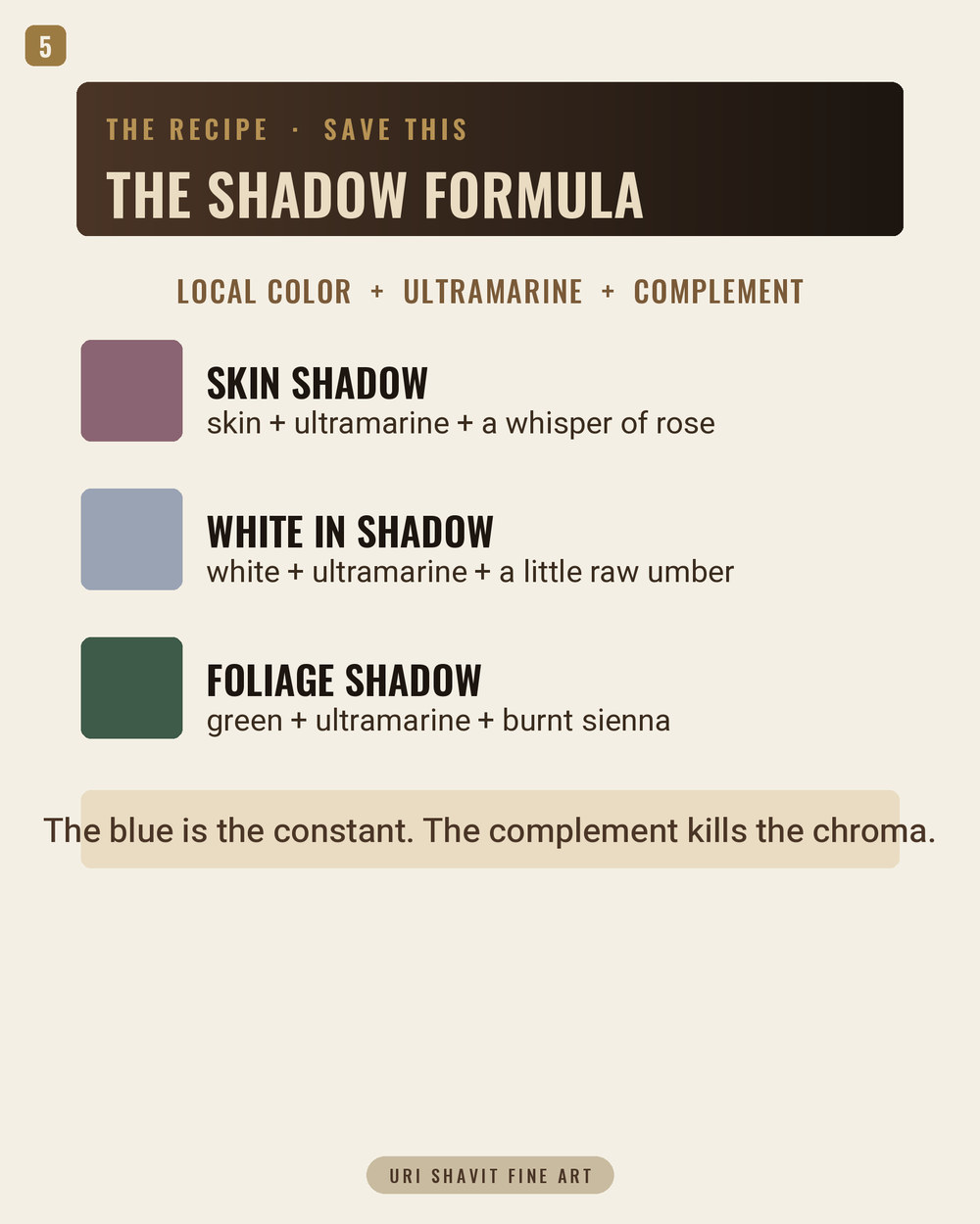
Ultramarine and titanium white - the shadow blue that stays alive. Add a very small amount of white to a mass of ultramarine and something counter-intuitive happens: the color first becomes more intense before it pales. Robert Gamblin describes watching "the light come on inside the ultramarine" as tiny amounts of white are added. Start with far less white than you think you need. The tint pushes toward lavender as you add more - that is the red bias, not a defect. Note also that titanium white has far greater hiding power than lead white; the same ratio produces dramatically different tint values with each.
Ultramarine and burnt sienna - the near-black that is not black. Mixed in roughly equal proportions, these two produce a deep, rich dark that reads as near-black in context but carries color temperature and life that black never has. Shift the ratio toward ultramarine for a cooler dark; shift toward burnt sienna to warm it. This is the mix I use for the deepest shadows in portrait work. The Palette Behind the Masters discusses this combination explicitly in the context of warm-dark shadow construction, showing how painters built depth without deadening the canvas.
Ultramarine and alizarin permanent - the transparent violet glaze. Ultramarine's red bias makes it the natural partner for crimson pigments. Gamblin specifically recommends Alizarin Permanent rather than traditional Alizarin Crimson here - standard Alizarin Crimson is fugitive, and the violet will shift over years as the red fades. Used as a thin glaze over a dried opaque tint of ultramarine and white, this is structurally how Vermeer built the turban in Girl with a Pearl Earring: scientific analysis confirmed an opaque tint base topped with a transparent pure-pigment glaze. The depth is not one pass of paint. It is the transparency of the pigment used correctly.
The Honest Caveat
Ultramarine will not give you a clean, bright sky blue. Its warm bias means tints go lavender, not cerulean. For a clear, cool, high-key sky, you need cerulean or cobalt. Ultramarine is not that pigment and should not be pushed to be.
The hue label situation is simpler than with cadmiums. Synthetic PB29 is already the affordable, chemically equivalent form of natural lazurite - the tube labeled "Ultramarine Blue" is already the equivalent. If you encounter a tube labeled "Ultramarine Blue Hue," check the label for PB29. If it contains phthalocyanine blue blended with red instead, you have a different pigment with different behavior, especially in glazing.
Go and Do One Thing
Replace your darkest dark this session with ultramarine and burnt sienna mixed on the palette. Adjust the ratio for the temperature you want. Put it next to a white and see whether it reads dark enough in context. It will - and it will stay alive in a way that black cannot manage. That is the argument ultramarine has been making since the 6th century. It just costs a great deal less to hear it now.
Get the free skin tone cheat sheet. Every mix in this article on one printable page, sent straight to your inbox.
Visit the Color Mixing Book Library for the three books this all comes out of.


Excellent article. Thank you. I use ultramarine blue in most paintings.