
Ultramarine Violet: Your Blue Pigment in Disguise

PV15 is not a separate mineral - it is ultramarine blue that has been baked until the chemistry flips. Here is what that means for how you mix it.
Your Blue Pigment Walked Into the Oven and Came Out Violet
People assume that every different color on the palette comes from a different mineral - a different place in the earth, a different ore, a different discovery. With ultramarine violet, that assumption is completely wrong.
The pigment in your tube is, chemically, ultramarine blue that has been heat-treated. Manufacturers take synthetic ultramarine blue (PB29), expose it to ammonium chloride or dry hydrochloric acid gas at 200-250 degrees C for up to four days, wash out the sodium chloride that forms during the reaction, and what comes out is PV15 - Pigment Violet 15, ultramarine violet. No new mineral. The same sodalite cage structure as the blue, but with sodium removed from the lattice, which shifts the chromophore and flips the hue from blue to violet. One jar, two colors, depending on what you do to it.
That single fact changes how you should think about the pigment. It is not an exotic violet. It is a close cousin of something you probably already own.
What PV15 Actually Is in Oil
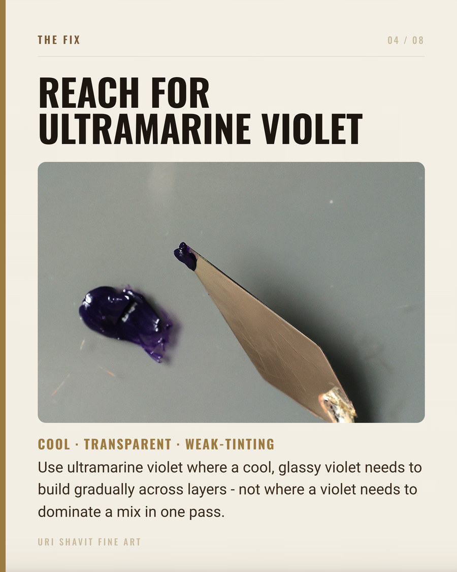
The Color Index name is Pigment Violet 15, C.I. 77007 - a sodium aluminum sulfosilicate. The MFA CAMEO database describes it under magnification as "fine, transparent violet grains mixed with deep blue grains," which tells you something immediately: even in a well-milled tube, PV15 retains a blue tendency that is part of its identity, not a defect.
In oil, the pigment is semi-transparent with moderate oil absorption (34-37 grams per 100 grams of pigment). It disperses readily and the paint body is "long" in the way all ultramarines are long - slightly stringy brushmarks from the hydrophilic nature of the pigment. If you have used ultramarine blue straight from the tube and noticed that slightly ropy quality, you already know how PV15 handles.
Tinting strength is a point of honest disagreement between sources. Retail descriptions tend to say medium-to-high. The MFA CAMEO entry, citing Plesters (1993), is more cautious: ultramarine violet "has poor tinting strength and is rarely used in artists paints." My experience sits closer to CAMEO - this is not a workhorse pigment that drives a mix. It colors a mix quietly. Lightfastness is ASTM Category I, the highest rating. In hue temperature it sits between cobalt violet (warmer) and manganese violet (cooler).
When It Arrived, and What Painters Used Before
Ultramarine violet is a purely 19th-century pigment. The manufacturing technique was developed in Germany around 1875 - a direct extension of the synthetic ultramarine blue process that Guimet in France and Gmelin in Germany perfected in 1826-1828. Before 1875, no painter anywhere had access to PV15.
It was the third of a new generation of mineral violets: cobalt violet (PV14) arrived in 1859, manganese violet (PV16) in 1866-1868, and ultramarine violet around 1875 - all products of what Gamblin calls "the color revolution of the 19th century" in the German chemical industry.
Before these pigments existed, painters had no lightfast violet. The medieval solution was to mix a blue - azurite or lapis lazuli - with red ochre or cinnabar. The results were muddy mixtures of blue and red sitting side by side, never a true single-chromophore violet. The organic dyes that appeared in some pre-1860s work as genuine violet have since faded completely. Pigment surveys confirm the consequence: violet appears in only 2%-4% of artworks made before the early 1860s. After the new synthetic violets arrived, that figure jumped to 36%-48%. The Impressionists became so devoted to violet that critics accused them of "violettomania."
The Failure Modes
Using it on acidic grounds or with acidic mediums. Ultramarine violet shares the critical weakness of every ultramarine: poor resistance to even weak acids. The CAMEO database flags it plainly - it "discolors when exposed to weak acids or sulfur fumes." Do not use PV15 in fresco, on acidic-sized canvases, or outdoors. Old resin-heavy mediums that have become acidic can degrade the pigment from within the paint film.
Expecting vivid, saturated tints with titanium white. PV15 is semi-transparent with low-to-medium tinting strength. Mixed into titanium white it goes gray-lavender, not vivid violet. Titanium white's high opacity overwhelms the semi-transparent particles and chalks the mix out. Lead white produces a warmer, less chalky tint because of its lower hiding power. With titanium white, use far less pigment than you think you need and accept that the tint will be quiet.
Trying to violet-up an earth shadow and seeing nothing happen. Because the tinting strength is genuinely low, PV15 is easily overwhelmed by raw umber, burnt sienna, or any mix that already contains a strong earth pigment. Add it to a dark shadow hoping to shift toward violet and the mix often slides into an indeterminate brown-gray. This pigment works far better in glazes or semi-opaque scumbles over a dry ground than as a workhorse mixing pigment in opaque shadow passages.
Three Mixes That Matter
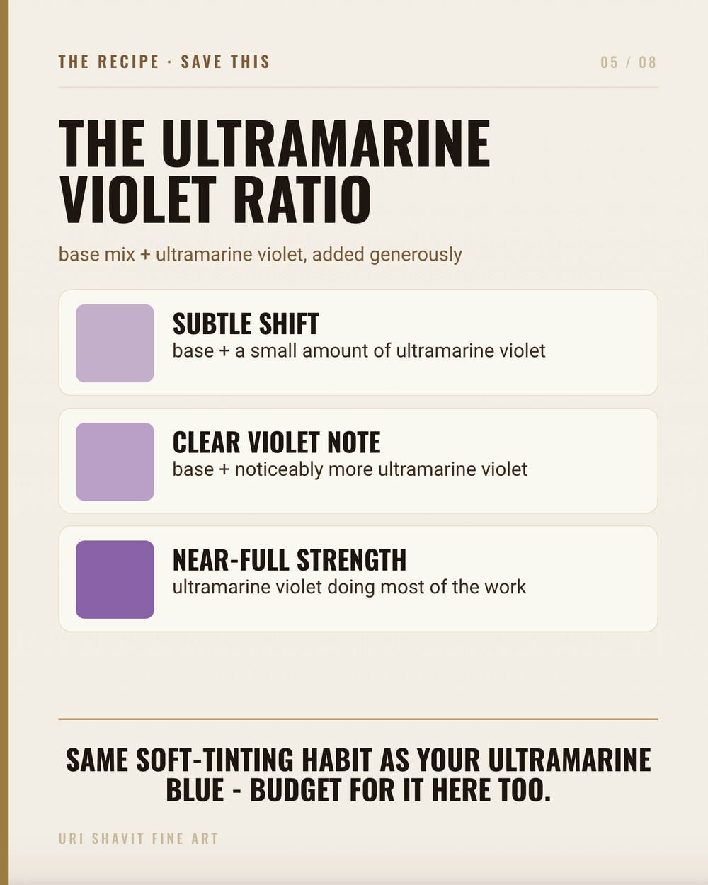
The optical bluing correction in flesh tone. One of the most useful properties of PV15 is its ability to make whites appear whiter in very small additions - the same optical bluing effect used in laundry agents. In portrait work, I add an extremely small amount of ultramarine violet to a flesh tone that is running too warm and too pink. The Palette Behind the Masters discusses this bluing effect directly: a minute violet addition shifts a white-heavy flesh mix toward the cool gray of a facial plane turning away from the light without muddying it. The quantity is smaller than you think - a fraction of what you would add of any other pigment.
A warm-cool vibration in flesh shadow alongside yellow ochre. Mixed with yellow ochre, ultramarine violet "sweetens" rather than deadens. Because PV15 sits between blue and red, its complement leans toward yellow-green rather than pure yellow, so a mix with ochre retains relatively high chroma. The result is a warm, slightly vibrating gray-violet shadow tone that reads naturally in skin. Pure cadmium yellow is a step too far - the mix can turn slightly khaki - but yellow ochre and PV15 produce something genuinely useful.
An atmospheric gray-violet for sky and stone. Mixed with white and a small touch of raw umber, ultramarine violet produces the blue-gray of a winter sky or a cool stone facade - the kind of atmospheric neutral that reads as cool without shouting purple. In thin films over a dry lighter passage, used as a glaze, it retains more violet character than in opaque mixes. Pissarro's boulevard paintings work on exactly this logic: strokes of violet and gray laid over an already-dry surface, not pushed into a wet ground where the violet disappears.
The Honest Caveat
There is no widely sold "ultramarine violet hue" carrying a substitute pigment index, so the hue-versus-genuine-pigment trap is less of a problem here than with some other colors. What you do need to check is that your tube lists PV15 specifically. Some manufacturers blend dioxazine (PV23) or quinacridone pigments to approximate the hue. Those are good pigments, but they will not give you the same optical bluing behavior, the same gray-toward-neutral quality in tints, or the same semi-transparent glaze character that makes PV15 worth having. "Mineral violet" on the label is a synonym for the genuine pigment - that is fine. A vague "violet" with no pigment index code is the thing to avoid.
What PV15 will not do is replace a strong violet anywhere saturation and tinting power matter. If you need vivid violet shadows in a high-chroma color key, dioxazine or quinacridone violet will serve you better. Ultramarine violet is a specialist - quiet, atmospheric, excellent in glazes and in small corrective additions.
Go and Mix Something Cool
The best first experiment with PV15 is the optical bluing test: mix a flat of your lightest flesh tone with titanium white, then touch in the smallest possible addition of ultramarine violet and draw it out. Watch what happens to the apparent warmth of the white. That shift - cool, clean, slightly receding - is what this pigment does that no other violet does in quite the same way.
Get the free skin tone cheat sheet. Every mix in this article on one printable page, sent straight to your inbox.
Visit the Color Mixing Book Library for the three books this all comes out of.


Comments