
Why the Old Masters Painted Skin Green First

Terre verte, the verdaccio tradition, and the three mixes that keep flesh from going sunburnt.
Stand close to an old master portrait in a museum. Close enough that the guard starts watching you. Look into the halftones - the passages where the cheek turns away from the light and the form begins to roll into shadow - and you will start to see it: a quiet, muted green sitting underneath the flesh.
It is not damage and it is not the varnish yellowing. It is a deliberate decision, and it is one of the oldest habits in European painting. Understanding it is the fastest way I know to stop painting sunburnt people.
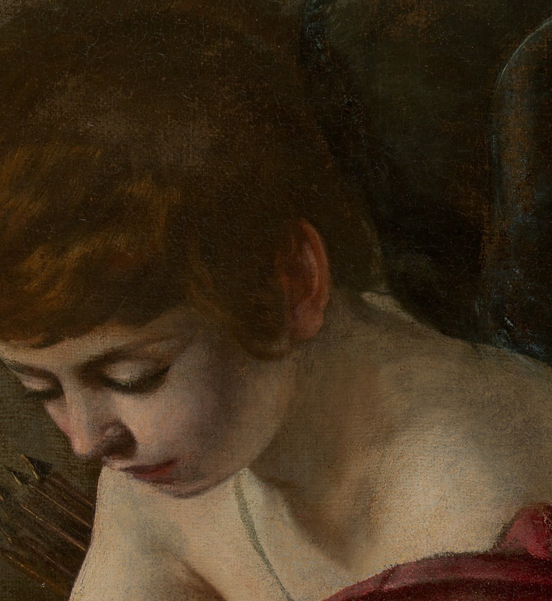
What terre verte actually is
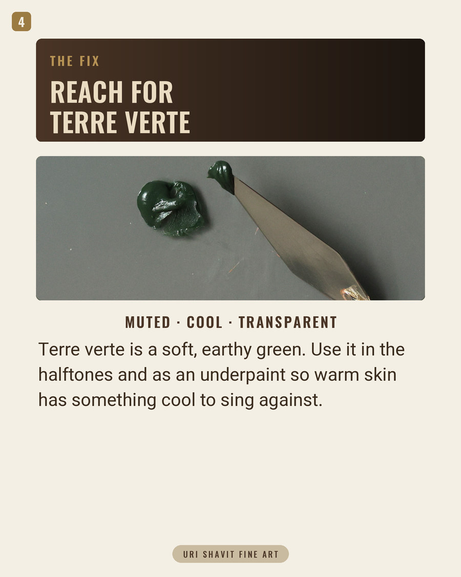
Terre verte - green earth - is a natural clay pigment, celadonite and glauconite dug out of the ground, and it has been in continuous use since the Romans. In modern tubes it carries the pigment index PG23. If your tube does not say PG23, you probably do not have real green earth, and that matters more than you would think.
Muted. Cool. Transparent. Very low tinting strength.
That last property is the interesting one. Most greens on a palette are bullies. Phthalo green will hijack a mix from a speck on the end of a palette knife. Viridian is cleaner but still assertive. Terre verte cannot dominate anything - it is so weak that beginners often decide the tube is defective and put it in a drawer.
That weakness is the entire point. It is the only green on the palette you can put under skin without turning your sitter into a frog.
The six-hundred-year-old habit
Cennino Cennini wrote the method down around 1400 in Il Libro dell'Arte, describing a practice that was already generations old. Model the face first in verdaccio - terre verte with white and a little ochre or black - working the whole head in that cool green-gray as though it were a grisaille. Then build the warm flesh over it in thin layers. The green never disappears. It stays visible in the halftones and the shadows, and it stays out of the lights.
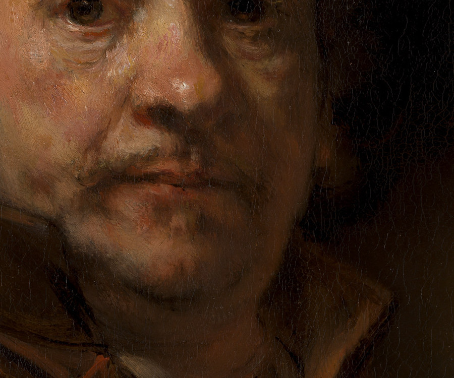
That literal green underpainting belongs to tempera on panel: Duccio, Giotto, the early Italians. When painting moved to oil on a toned ground the technique changed, and it would be wrong to say Caravaggio or Rembrandt laid in a green face. But the principle survived completely intact, and you can see it in their halftones - a cool, slightly green neutral holding the turn of the form so the warm lights have something to sing against.
The reason it works is optical, and it is worth understanding rather than just copying. Red and green sit opposite each other on the wheel, so a warm flesh tone laid over a cool green neutral does not read as a flat sheet of color - the two are quietly cancelling underneath. And that is what skin genuinely is: a translucent surface with light entering, scattering, and returning cooler in the mid-tones. Green under warm is the paint equivalent of subsurface scattering, four hundred years before anyone had the phrase.
Where painters go wrong with it
There are two failure modes and they sit on opposite sides of the same mistake.
The first is skipping green entirely. You mix skin from warm pigments, you build the halftones out of the same warm family, and every plane on the face ends up as some version of orange. The result is unmistakable - the portrait looks raw and sunburnt, and no amount of drawing correction will fix it, because the drawing was never the problem.
The second is overdoing it. Someone reads about verdaccio, paints a genuinely green face, glazes one thin warm layer over the top and produces a corpse. Terre verte is transparent and weak; if you lay it on thickly enough to see clearly at the underpainting stage, it will still be shouting through three flesh layers later.
The practical middle. You do not have to commit to a full classical underpainting to get the benefit. Put the green into the halftone mix itself rather than under everything. You keep most of the optical effect, you keep control of the value, and you can back out at any point.
The three mixes that matter
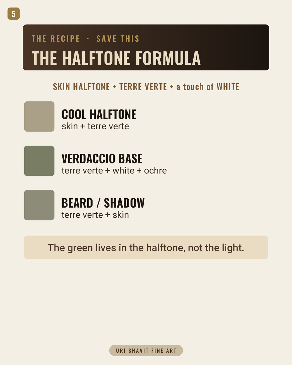
Cool halftone - skin + terre verte. The workhorse. The turning plane of the cheek, the temple, the flat under the eye, the plane in front of the ear. Mix your normal flesh tone first, then add terre verte a touch at a time until the warmth stops shouting. You are not trying to make it green. You are trying to make it stop being orange.
Verdaccio base - terre verte + white + yellow ochre. The classical underpainting mix, if you want to work traditionally. Keep it light in value - it should look like a pale sage, not a leaf. Swap the ochre for a whisper of black and you get a colder, more Florentine version.
Beard and shadow - terre verte + skin, pushed further. The five o'clock shadow on a shaved jaw is the single most useful application of this pigment in a modern portrait. Real hair under translucent skin genuinely reads as a cool green-gray, and painting it with black or blue is why so many painted beards look like smudges. Rembrandt's beard above is exactly this mix in seventeenth-century terms.
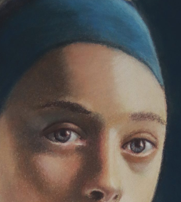
The rule to keep. The green lives in the halftone, not the light. The moment terre verte appears in a highlight, the face turns to stone.
What terre verte mixes well with
With burnt sienna - two weak, well-mannered earths that neutralize each other gently. This pair gives some of the most useful quiet grays on the palette, and neither will run away with the mix.
With yellow ochre - olive greens for cloth and foliage that never scream. If your background greens have been too loud, this is the fix.
With white alone - a cool sage that sits perfectly in the plane between light and shadow on a pale sitter.
With cobalt blue - cools the halftone twice over. Powerful, and very easy to overdo; a whisper of each rather than a spoonful of both.
One warning about the tube
Because real green earth is so weak, several manufacturers sell a terre verte hue instead - usually chromium oxide green with black and white doing the work. Those mixtures have several times the tinting strength of the genuine pigment, and if you use one at the quantities described here you will get exactly the green corpse everybody fears. Check the barrel for PG23. If it says anything else, start with half as much and work up.
If you cannot find the real thing, viridian heavily cut with burnt umber and white is a reasonable stand-in - not identical, but polite enough to sit under skin.
What to do with this
Next time you are in front of an old master portrait, ignore the lights and look at the halftones. Then look at your own last portrait and ask where the cool went. In my experience that single question closes most of the gap between a painting that looks like a person and a painting that looks like a person made of plastic.
Get the free skin tone cheat sheet. Every mix in this article on one printable page - the sheet that hangs by my easel. It lands in your inbox a minute after you ask for it.
Keep reading: The cleanest way to cool skin - How to mix skin color with oil paint - The Munsell system for describing color


Comments