
Emerald Green: The Brilliant Pigment That Painted a Century and Poisoned It Too

How copper acetoarsenite became the most exciting and most dangerous green on the Victorian palette, and what the modern tube labelled "Emerald Green" actually contains.
The Pigment That Dressed Victorian England and Killed Some of It
People talk about emerald green as though it is just a vivid, old-fashioned color - the kind of thing you see on a Victorian wallpaper roll in a period drama. What they usually skip is that the pigment responsible is copper acetoarsenite. Arsenic. The same compound used, under the name Paris green, as the world's first registered chemical insecticide. Factory workers who made it developed chronic poisoning. Children who slept in damp rooms papered with it got sick. Napoleon Bonaparte, exiled on St Helena, may have spent his final years in a bedroom hung with emerald green wallpaper - some historians believe that played a role in his death, though the claim remains unsettled.
That is not really a myth. The interesting question for a painter is not the toxicology - that story is over, you cannot buy the real pigment anymore. The question is what made Monet, Seurat, Turner, Manet, van Gogh, and Gauguin all reach for something they knew was dangerous. And then what you are actually holding when you open a modern tube labelled "Emerald Green."
What the Pigment Actually Is
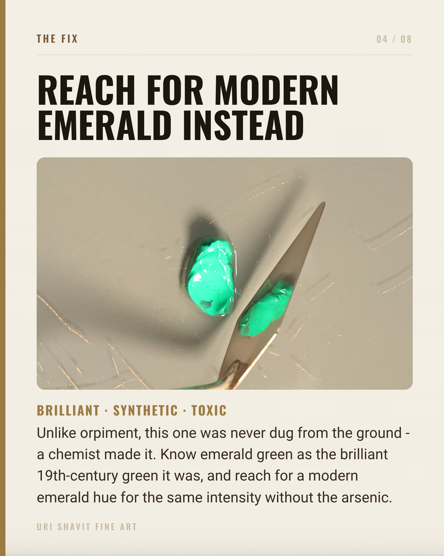
Emerald green is copper(II) acetoarsenite - Color Index PG21 - made by reacting sodium arsenite with copper sulfate and acetic acid. It appeared under a remarkable number of trade names: Paris green, Schweinfurt green, Veronese green, Vienna green, Imperial green, King's green, parrot green, English green. One pigment, many labels.
In oil it is semi-opaque, with fair hiding power and a cool blue-green color of unusual saturation. Particle structure matters: early production used coarser grinding and gave more durable results. Later manufacturers ground it more finely, which improved workability but reduced permanence. This is why sources conflict - the MFA CAMEO database calls it lightfast, while conservation literature is more cautious. Both can be right depending on the batch. No formal ASTM lightfastness category was ever assigned, most likely because the pigment left production before systematic ASTM testing of artists' pigments began in the late 1970s. The toxicity is not in dispute. The pigment is no longer manufactured for artists.
The Historical Thread
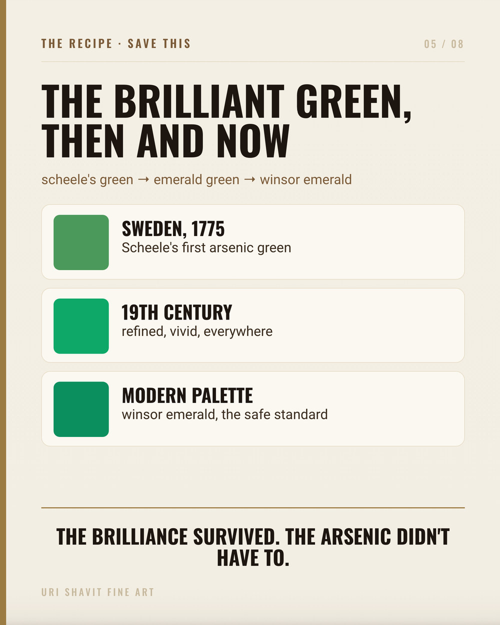
Emerald green did not exist before 1814. Wilhelm Sattler and Friedrich Russ invented it in Schweinfurt, Germany, as an improvement on Scheele's green - a simpler copper arsenite invented by Carl Wilhelm Scheele in 1775 that tended to darken around sulfides. Justus von Liebig published on the method of manufacture in 1822-1823, and the pigment spread fast - into studios, wallpaper factories, textile dyes. In 1867 it was recognized as the first chemical insecticide, effective against the Colorado potato beetle.
Before 1814, painters had no bright synthetic green. The options were verdigris (various copper acetates, the most intense green of the Renaissance), copper resinate (a glaze prone to darkening to brown), malachite (too pale when finely ground in oil), and green earth (a natural pigment of notably dull color). Old Masters isolated verdigris layers between varnish coats to slow chemical change - the same technique that helped stabilize emerald green in varnish medium rather than raw oil.
Turner and Manet both used emerald green. Monet used it through his early and middle career, then abandoned it for viridian. The National Gallery's technical research on his late palette records the reason plainly: viridian was more permanent. Van Gogh and Gauguin placed vivid reds next to emerald green in 1888 for jarring chromatic contrast, though precise conservation identification of specific passages in individual works remains incomplete in the sources available to me.
The Failure Modes
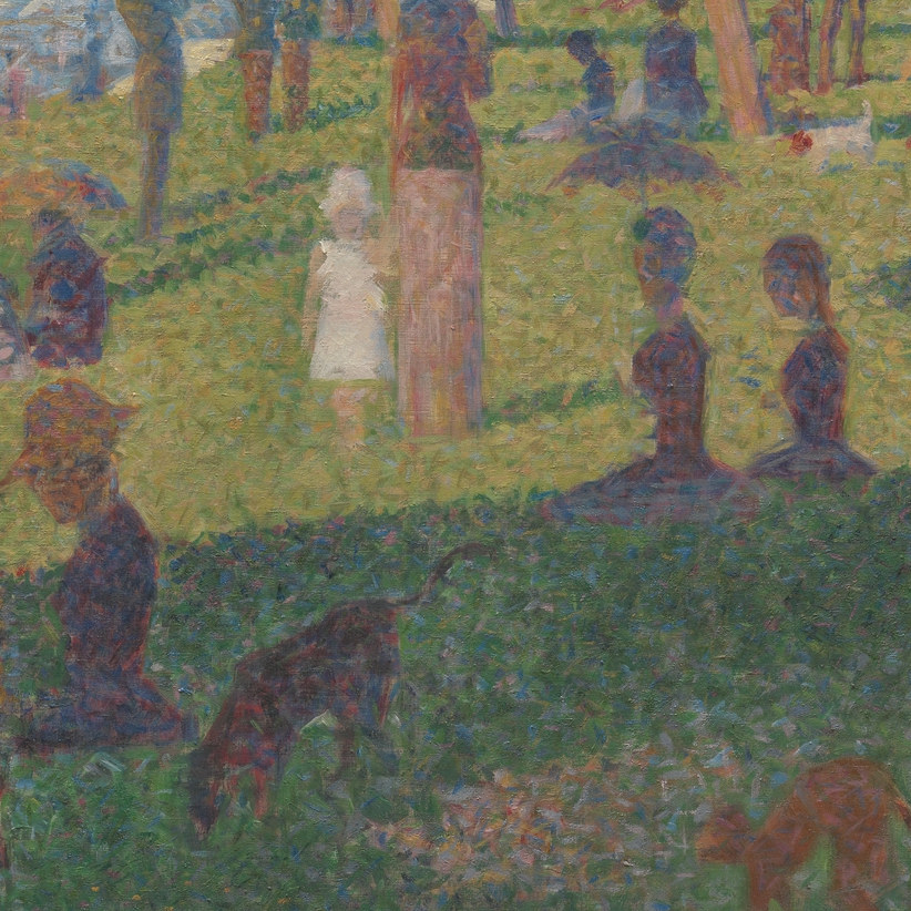
Mixing with any sulfur-bearing pigment. Cadmium yellow is cadmium sulfide. Vermilion is mercuric sulfide. Ultramarine blue contains sulfur in its lattice. Mix emerald green with any of them and you get a chemical reaction, not a color mix - an irreversible deep brown. Period painting manuals warned against this combination repeatedly, and the degradation in Seurat's grass passages is the consequence made visible. The brownening is not recoverable.
Treating the modern hue tube as equivalent to the historical pigment. Today's "Emerald Green" tubes contain no copper acetoarsenite. Gamblin's version uses PG36 (chlorinated and bromated copper phthalocyanine), PW6 (titanium dioxide), and PY74 (arylide yellow). It is rated Lightfastness I and is semi-transparent. The original PG21 was semi-opaque, cooler and more saturated in masstone, and behaved completely differently in glazes. If you are trying to understand how Monet built a passage in 1869, a modern emerald green hue tube will not help you. The two paints share a name and a visual resemblance, and very little else.
Using it in the wrong medium. The original pigment is soluble in acids and alkalis and breaks down on prolonged contact with water - which ruled out fresco, watercolor on alkaline paper, and size-based grounds. In raw oil it was more reactive than in varnish medium, which is why careful painters isolated it. This is historical information rather than a practical warning, since the pigment is gone, but it explains why period sources gave the instructions they did.
The Three Mixes That Matter
Emerald green with cobalt blue and a little viridian, for a muted gray-green. Conservation analysis at the National Gallery identifies this as Monet's combination for the dull green gunwale in Bathers at La Grenouillere (1869). The Impressionists did not always use emerald green as a pure chromatic hit - here it is controlled and subdued. With the modern PG36-based hue you can approach the mix, but the masstone will sit lighter and the transparency profile is different.
Emerald green with viridian only, for cool foliage that holds saturation in shadow. Monet's eventual move to viridian alone tells you what each pigment was contributing. Viridian is darker in masstone and slightly less saturated in tints. When Monet used both together, emerald green was supplying a cool, opaque lift that viridian could not manage solo. With modern pigments you are solving the same color problem with a different set of tools.
Emerald green placed next to a warm red, for jarring simultaneous contrast. This is van Gogh and Gauguin in 1888 - the cool blue-green against vivid red, producing an almost uncomfortable vibration. The principle works with any high-saturation complementary pair. A modern emerald green hue beside cadmium red gives you a version of the effect, though the original's greater opacity and cooler temperature made the confrontation starker.
The Honest Caveat
The real emerald green is gone, and that is not a small difference. The modern hue tube is lightfast, safe, and genuinely useful. But it is not what Monet was holding, and it is not what Seurat was mixing. Painters in the nineteenth century accepted the toxicity, the sulfur incompatibility, and the uncertain permanence because nothing else looked like it. When viridian became reliable, the careful ones switched. The less careful ones left us paintings where the grass has turned brown.
The modern hue is Lightfastness I. Your work will outlast theirs.
Go and Look at the Degradation
Find a high-resolution image of Seurat's A Sunday on La Grande Jatte and compare it to the preparatory studies. The studies show fresher color because the paint layers are thinner and the zinc yellow has degraded less. That comparison gives you a working lesson in what emerald green's surviving component looks like when its companions have failed it. You are not seeing the pigment at its best.
Then squeeze out whatever emerald green hue you have, mix it with cobalt and viridian on a scrap of canvas, and hold it next to a warm red for a few minutes. That vibration is why painters accepted the arsenic for a hundred years. You get the argument now without the poison.
Get the free skin tone cheat sheet. Every mix in this article on one printable page, sent straight to your inbox.
Visit the Color Mixing Book Library for the three books this all comes out of.


Comments