
Ivory Black: The Pigment That Has Never Touched Ivory

What is actually in the tube, why it dries slowly, and how Rembrandt used bone black to make a robe darker than the shadows behind it.
The Myth on the Label
Let's start with the obvious: the ivory black in your paint box has almost certainly never been anywhere near a piece of ivory. The name is a historical label that survived long after the material it described became first expensive, then essentially illegal. The animals that produce ivory are internationally protected, and no commercial paint manufacturer makes this pigment from charred ivory today. What you are buying is fine-grade bone black - charred cattle or pig bone - and in some manufacturers' formulations, that bone black comes with a small addition of Prussian blue to nudge the undertone slightly cooler.
I find it a bit ironic that this is the black people tend to trust most, the one that sounds the most classical, the most connected to the old masters. It is not wrong to trust it. But you should know what you are holding.
What the Pigment Actually Is
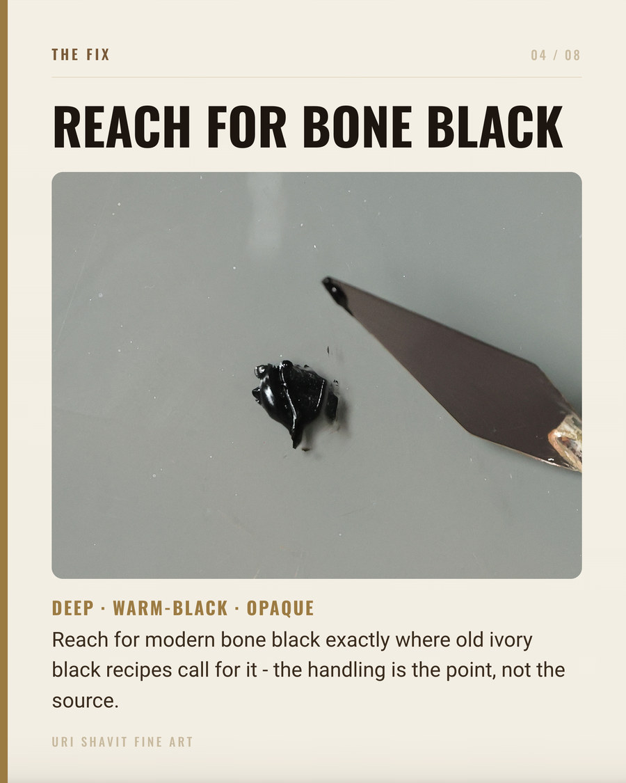
Ivory black carries the Color Index name Pigment Black 9, PBk9. The original material was roughly 10 to 20% carbon by weight, with the rest being calcium hydroxyapatite - the mineral component of bone and ivory - along with smaller amounts of magnesium phosphate and calcium carbonate. Today, bone black made by charring animal bones at around 550 degrees Celsius without oxygen is the commercial standard. A fine particle size and carbon content of 15% or more is what earns the label "ivory black" over plain bone black.
In oil, the first thing you notice is the undertone. Ivory black is not a neutral black. It reads slightly warm in masstone but leans blue in tints - which is exactly why mixing it with yellow ochre gives you a green-gold rather than a brown-black. The blue pull of the undertone shifts the ochre sideways toward green. Understand that and you can use it intentionally.
Tinting strength is moderate. Gamblin describes it as weak compared to Mars black (PBk11) or carbon black (PBk7). I prefer "moderate" in practice. It means ivory black will not annihilate a mixture the way Mars black sometimes does. You can add it gradually and still have something left of the color you started with.
The slow drying is real. Carbon black pigments are characteristically slow to dry in oil, though bone black absorbs far less oil than lamp black - roughly 46 to 49 parts linseed oil per 100 parts pigment, versus about 117 parts for lamp black. Ivory black dries at an average pace rather than an impossibly slow one, but average still means it is not ready for a second layer as quickly as fast-drying earth pigments like raw umber.
The Historical Thread
This is the oldest pigment in the kit. Bone black has been in use since prehistoric times, identified in cave paintings, Egyptian works, Greek and Roman art, and throughout European painting without interruption from the medieval period onward. Unlike cobalt blue or cadmium yellow, there is no point in history where a painter needed a substitute for it. Every painter discussed on this blog had access to it.
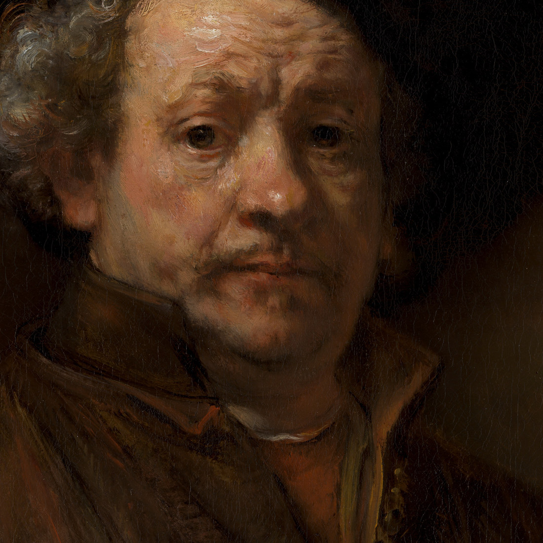
Rembrandt's palette was built on bone black. Technical examination of his paintings has shown its widespread use in the initial wash-like sketch over the ground layer. For black clothing worn by his sitters, it was essential - earth pigments could carry the shadows, but black costume required more intensity. The documented pigment analysis of his Self-Portrait of 1659 (Gifford and Glinsman, National Gallery of Art, 2014) found bone black with traces of lead white, ochres, and vermilion in the coat, the fur collar, and the shadow of the hands. That combination is the practical lesson: pure bone black in masstone reads as near-absolute dark, while small warm additions prevent the shadow from going cold and dead.
Vermeer used ivory or bone black as one of his seven principal pigments. And Anders Zorn's famous four-color limited palette - yellow ochre, ivory black, vermilion, and lead white - built some of the most convincing flesh in 19th-century portraiture using this black as its only dark. These painters chose bone black on purpose.
The Failure Modes
Painting over an ivory black underpainting too soon. Carbon blacks are slow to dry, and if you apply thick or resinous upper layers before the ivory black layer has cured through, the upper layer can wrinkle, sink, or crack as the underlayer finishes drying beneath it. The traditional fix is to mix a fast-drying medium into the ivory black layer, or add a siccative pigment like raw umber, which accelerates curing because of its manganese content.
Overusing it in mixtures and wondering why everything looks dull. Ivory black is semi-transparent. When you add it to a chromatic color to push the value down, you also desaturate that color at the same time. Past a certain point you stop deepening the value and start killing the chroma. Painters who want a deeper color without losing vitality should use it sparingly, test in thin layers, or consider a mixed dark - burnt sienna and ultramarine blue, for example - which yields an optically richer result.
Trusting the label without checking the formulation. Some manufacturers add Prussian blue to their ivory black, which shifts the undertone noticeably cooler. If you are mixing grays and finding them colder than expected, check the tube's pigment index. The label says ivory black; the pigment list tells you what is actually there.
The Three Mixes That Matter
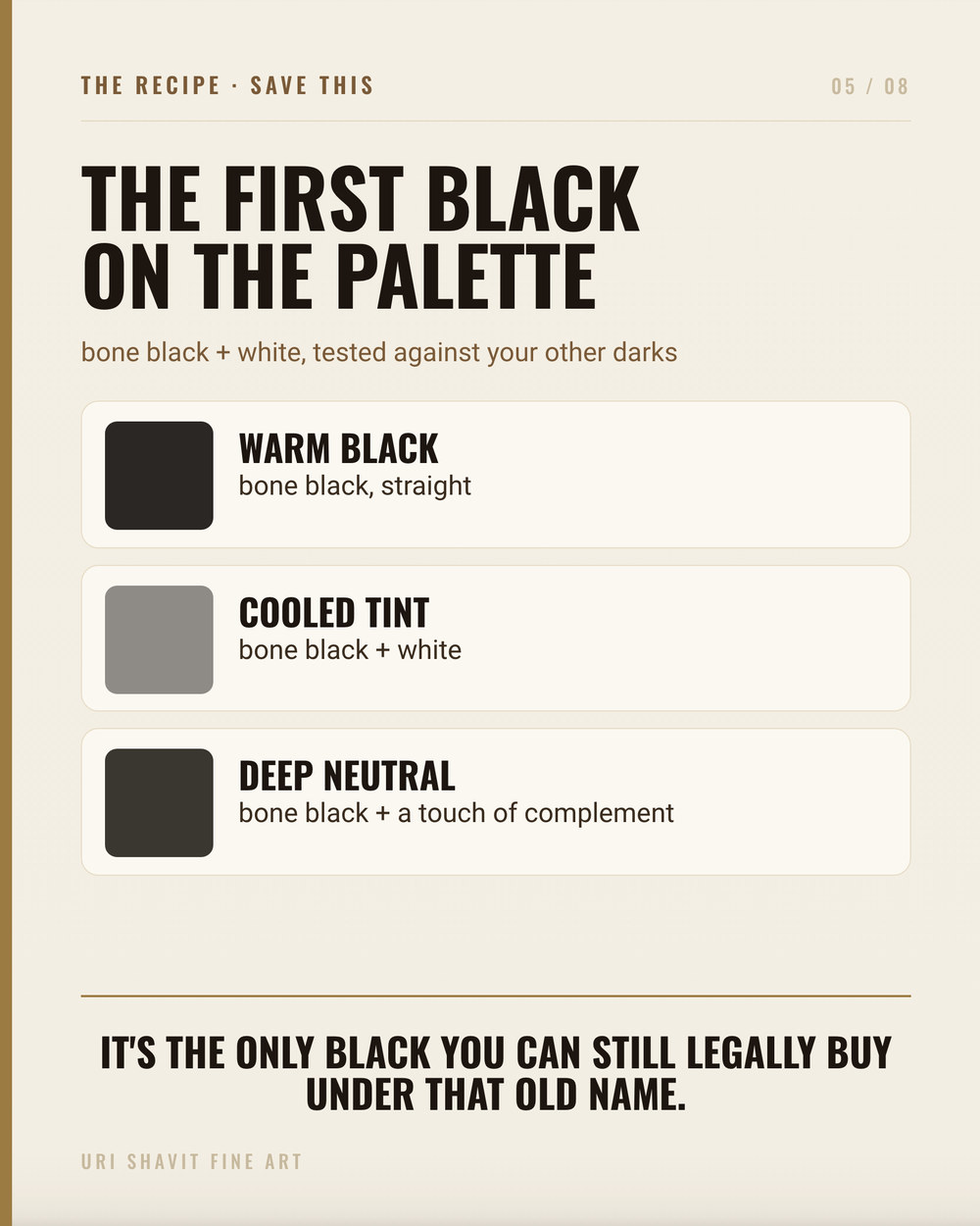
Ivory black plus white for neutral grays. This is the foundational mix, and Rembrandt used a version of it for virtually every gray in his work - bone black, lead white, and small touches of red lake or ochre to warm or cool the result. The blue undertone of ivory black in tints means the raw gray will feel slightly cool; a small amount of yellow ochre or burnt sienna pulls it back toward warm neutrality. In The Palette Behind the Masters, this construction - black plus white with a warm earth correction - is identified as the structural gray mix behind the halftone in multiple Dutch portrait analyses. It is not a shortcut; it is the method.
Ivory black plus yellow ochre for chromatic darks and olive tones. Add ivory black to yellow ochre in increasing amounts and you do not get a dark brown - you get a series of green-golds and olive tones. This is the blue undertone of the black shifting the warm yellow toward green. Zorn used this combination to push warm skin tones into shadow without going muddy. Keep the ivory black proportion modest and the result is a useful warm shadow; push it too far and you gray out the yellow.
Ivory black glazed thin for transparent darks. Because ivory black is semi-transparent, a thin glaze over an already-dark passage creates depth that an opaque pigment cannot. Where Mars black would sit on the surface as a flat, opaque stop, a thin ivory black glaze sinks the value while allowing the color and texture beneath to breathe through. This is the principle behind Rembrandt's black costume passages - built tone, not a single opaque application.
The Honest Caveat
Ivory black will not give you the darkest possible dark in a single opaque application. If you need flat, opaque black quickly - for a background or a strong underpainting - Mars black will do that job faster and more decisively. Ivory black's moderate tinting strength and semi-transparency are features in mixtures and glazes, but they are limits when opacity and speed are what the situation requires.
Also: check the pigment list before you rely on the undertone. Bone black alone reads slightly warm. Bone black plus Prussian blue reads noticeably cool. The tube label will not tell you which you have without reading the fine print.
What to Do Next
Take your tube of ivory black and make a simple tint series with white. Add ivory black one small touch at a time and notice at the lighter end whether the gray pulls warm or cool. That undertone is the most important thing to know about your specific tube, and five minutes of swatches will tell you more than any label. Then try the ochre mix: equal parts yellow ochre and ivory black, then shift the ratio in both directions. The range from warm olive to dark khaki is sitting there waiting to be used.
Get the free skin tone cheat sheet. Every mix in this article on one printable page, sent straight to your inbox.
Visit the Color Mixing Book Library for the three books this all comes out of.


Comments