
Lead-Tin Yellow: The Old Masters' Favorite Yellow That Science Forgot

It disappeared from every palette around 1750, and nobody noticed for almost two centuries - here is what it actually does in oil and why it matters now.
The Yellow Nobody Missed
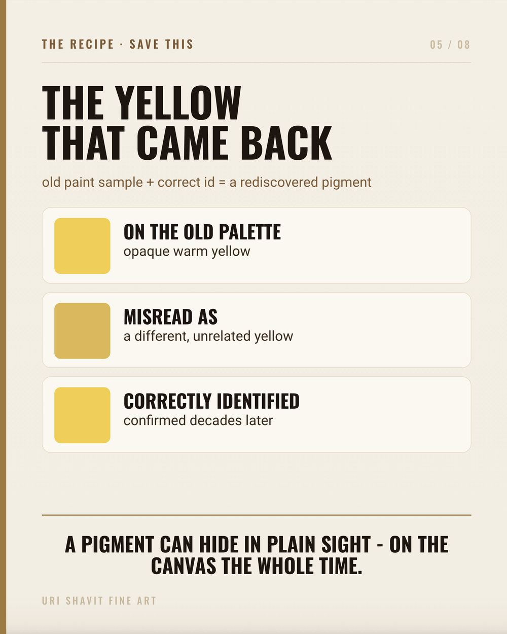
People say the Old Masters had secrets. Mysterious mediums, lost varnish formulas, techniques nobody can replicate. Most of the time that is romantic nonsense. But occasionally the story is stranger than the romance, and lead-tin yellow is the best example I know. This was the dominant bright yellow in European painting for roughly four hundred years - used by Titian, Vermeer, Rembrandt, Raphael, Bellini - and then, around 1750, it quietly vanished. No dramatic rejection, no announcement. It just dropped out. Conservators looking at those paintings for the next two hundred years labeled it Naples yellow, or massicot, or simply "yellow," and moved on.
It took a chemist with an X-ray diffraction machine to find it again. In 1941, Richard Jakobi, director of the Doerner Institute in Munich, identified the compound sitting in old paint films and named it Blei-Zinn-Gelb - lead-tin yellow, a literal German translation. He had not discovered a new pigment. He had found one hiding in plain sight on some of the most studied canvases in the world for two centuries. After 1967, Hermann Kühn's systematic studies of roughly thirty Rembrandt paintings confirmed just how consistently the pigment had been used, and established the distinction between its two structural types.
That is the kind of story that stops you mid-palette-knife. So let's look at what the pigment actually is.
What Lead-Tin Yellow Actually Is
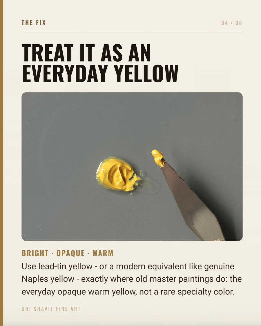
There are two distinct compounds that travel under the same name. Type I is a lead stannate (Pb2SnO4), made by heating lead oxide and tin dioxide at 650-800 degrees Celsius. It leans toward a cooler, lemon yellow, is semi-opaque, and has genuine tinting strength. Type II is a lead silicate produced at higher temperatures with added silica. It is warmer and more ocherous, and significantly more transparent than Type I - which makes it suited to glazing warm yellow passages rather than building opaque lights. Type I is what you find most often in Northern Baroque painting. Type II turns up mainly in earlier Florentine, Venetian, and Bohemian work.
In oil, both types behave well technically. The pigment needs very little oil to grind - around 16 grams per 100 grams of pigment, which is lean - dries fast, and forms an excellent film. It has a saturated, readable hue and is stable under normal atmospheric conditions. The ASTM has not formally rated it for lightfastness, but independent studies have found it permanent in oil. The hazards are real: it is a lead compound, carcinogenic, teratogenic, and a suspected mutagen. Skin contact can cause ulcers. And it darkens on exposure to sulfur fumes, which matters both for storage and for what you mix it with.
The Historical Thread
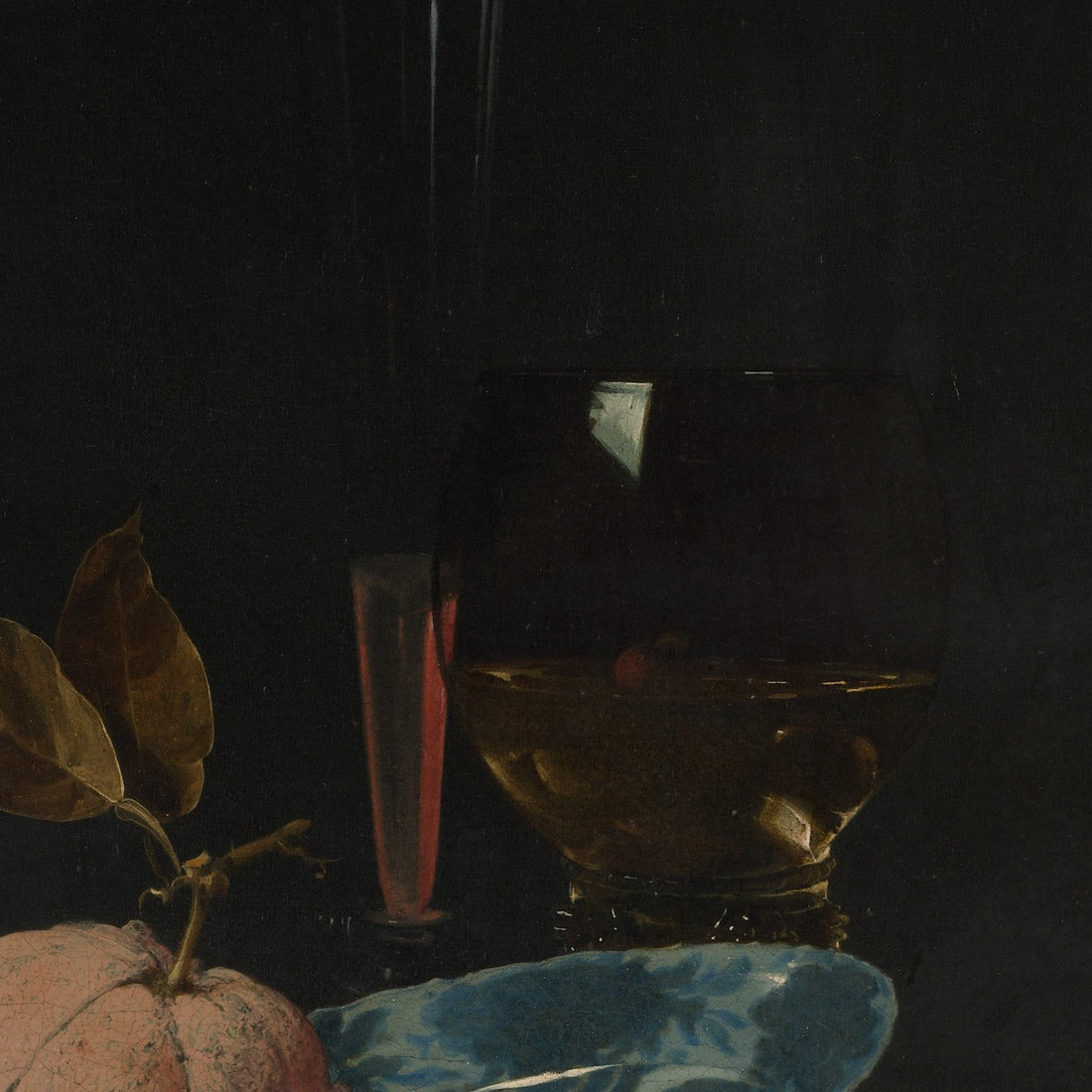
Type II dates to at least the 13th century, probably discovered as a by-product of lead crystal glass production. The earliest written recipe appears in the Bolognese manuscript, compiled in the first half of the 15th century. By then, Type I had already become the standard bright yellow in European oil painting, and it stayed there for over three hundred years.
Before it, northern European painters had almost no equivalent bright, opaque yellow. The main options were yellow ochre (opaque but muted, an earth), massicot (yellow lead oxide - a related but chemically different compound), and orpiment (arsenic trisulfide - vivid canary yellow but incompatible with lead and copper pigments, meaning it could not share a painting with verdigris or azurite without risking blackening). Orpiment was more widely used in Italy, imported from Asia Minor, than in northern Europe. In Bellini's The Feast of the Gods, lead-tin yellow and orpiment appear across different draperies in the same painting - one of the most useful comparative documents that exists for understanding the period's yellow strategies side by side.
The replacement that ended lead-tin yellow's four-century run was Naples yellow - lead antimonate - which took over in the early 18th century. One plausible hypothesis for the forgetting is terminological: the pigment was called "massicot" and "giallorino" interchangeably with several other yellows, including plain yellow lead oxide. Once the distinction blurred in workshop practice, the specific compound drifted out of conscious use. After 1750, no paintings appear to contain it.
The Failure Modes
Lead soap formation. This is the serious one. Type I has a strong tendency to react with fatty acids from oil hydrolysis over time, forming colorless lead carboxylate inclusions - lead soaps - within the paint film. These can break through the paint surface, form disfiguring crusts, or cause formerly opaque yellow highlights to become semi-transparent over centuries. The Metropolitan Museum has an active research program on exactly this mechanism. The painter who applies lead-tin yellow thickly in an oil-rich paste is accelerating the process. Lean, low-oil application matters.
Sulfur sensitivity. Lead-tin yellow blackens in the presence of sulfur fumes - a hazard it shares with other lead-based pigments. Working alongside cadmium yellows or vermilion in a poorly ventilated space, or storing work where sulfur is present, puts those passages at real risk.
Terminology confusion when sourcing. "Massicot" now refers to plain yellow lead oxide, a different compound with different handling properties. If you order massicot expecting lead-tin yellow, you will receive the wrong material. And there is no "lead-tin yellow hue" sold by reputable manufacturers - no modern substitute approximating it under that name. It is reproduced from period recipes by specialist suppliers, and sourcing it requires precision.
Three Mixes That Matter
Lead-tin yellow with lead white for the opaque warm light. This is the most fundamental use and the one Rembrandt returned to throughout his career. In Belshazzar's Feast, the brocaded cloak is essentially pure lead-tin yellow at full strength. The golden dress in the same painting adds deep yellow ochre and haematite to a lead white and lead-tin yellow base - giving it warmth and weight rather than a raw lemon note. Kühn's palette analysis of roughly thirty Rembrandt paintings confirmed this pairing as a consistent element of his practice.
Lead-tin yellow with natural ultramarine for the luminous halftone. Vermeer used this pairing in the sleeve of The Milkmaid - complementary pigments mixed directly to produce a luminous, slightly greenish shadow rather than dead gray. The same move appears in Rembrandt's Belshazzar's Feast, where the lighter parts of a sleeve combine lead-tin yellow with natural ultramarine. A warm yellow and a cool violet-blue, kept at relatively high value, gives you a halftone that still reads as light. If your shadow passages keep going muddy and flat, this is the structure worth studying carefully.
Lead-tin yellow with ochre and red lake for the full drapery range. This is the Renaissance drapery structure, documented in Bellini's The Feast of the Gods and in Rubens's workshop practice. Lead-tin yellow provides saturation and opacity in the lights; ochre anchors the midtones toward warm gold without exhausting the brighter pigment across the whole canvas; red lake in the shadows keeps the darks from going gray. That template - bright opaque yellow in the lights, earth for midtones, warm red to deepen - is a structural approach that holds regardless of which specific yellow you are working with today.
The Honest Caveat
Lead-tin yellow is not a pigment you will find in a standard art supply catalog. It is reproduced by a small number of specialist suppliers, and given its toxicity, working with it requires genuine precautions - no skin contact, no dry pigment in an unventilated space. The closest modern alternative is nickel titanate yellow, which has a pale greenish-lemon undertone and low tinting strength. It behaves quite differently from the original, and substituting it in hopes of replicating the Rembrandt fabric highlight will disappoint you on tinting strength alone.
The lead soap formation problem is not theoretical - it is visible in X-ray images of actual Rembrandt paintings today. Lean application is not optional if longevity matters to you.
Go Look at the Paintings
The most useful thing you can do right now is not to source the pigment. It is to find a good reproduction of Belshazzar's Feast and locate the flaming inscription and the brocaded cloak - those are the passages in essentially pure lead-tin yellow. Then look at The Milkmaid and find where the warm yellow tunic meets the blue skirt and trace that halftone in the sleeve. Those color decisions are what the pigment made possible. The problem it solved - how to put a warm, opaque, saturated light into a dark composition without it turning chalky - is sitting on your palette right now, whatever yellow you happen to be using.
Get the free skin tone cheat sheet. Every mix in this article on one printable page, sent straight to your inbox.
Visit the Color Mixing Book Library for the three books this all comes out of.


Comments