
Smalt: The Blue That Decided to Go Gray

The Renaissance's affordable cobalt blue had one catastrophic secret, and old paintings have been revealing it ever since.
The Blue That Was Never Supposed to Fade
People say old paintings turn dark because the varnish yellows. That is true, and it matters. But there is another shift happening underneath the varnish in a lot of Renaissance and Baroque canvases. Whole sky passages and cool background shadows have drifted from blue to a greenish gray or brownish nothing - and the varnish is innocent. That is smalt doing what smalt does when the chemistry turns against it.
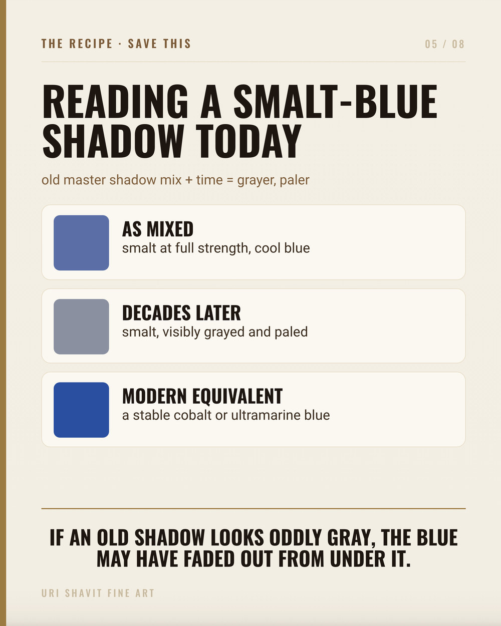
The carousel puts it plainly: this blue was never supposed to turn gray. The painters who chose it thought they were buying a serviceable, affordable cobalt blue. For a generation or two, they were right. Then the potassium started leaching out of the glass particles and into the oil, and the blue went with it. The details of why it happens - and how to avoid repeating the mistake - are worth knowing if you are going to use it.
What Smalt Actually Is
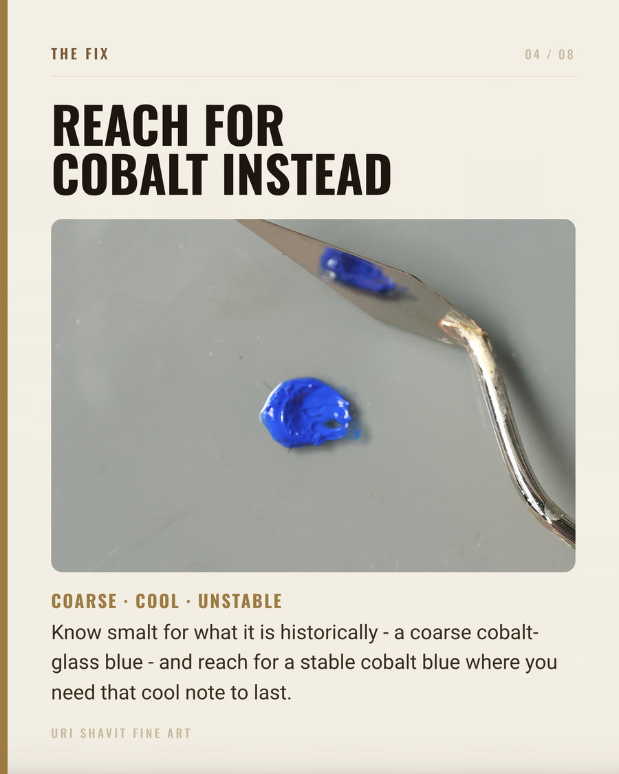
Smalt is glass - specifically, cobalt potassium silicate glass, made by fusing cobalt oxide with silica and potassium carbonate derived from wood ash, quenching the melt in water, and grinding the cooled result to a powder. The name comes from the Italian smaltare, to melt. The Color Index name is PB32, CI 77365.
Because it is a glass, smalt has no precise chemical formula. Cobalt oxide content ranges from 2 to 18 percent, silica from 66 to 72 percent, potassium from 10 to 21 percent. Royal Smalt is a coarser-ground variant with higher cobalt content; the larger particle size and greater cobalt together produce a noticeably deeper blue.
The glass nature controls everything about how this pigment behaves. Its particles are vitreous and highly reflective. Grind them finer and you fracture those surfaces, create more light-scattering sites, and kill the color - the pigment goes from grayish blue to near-white powder. Smalt cannot be ground the way you grind an earth. It must stay coarse.
In oil, smalt's refractive index (roughly 1.46-1.55) sits too close to that of dried linseed oil (around 1.48-1.52). The glass particles nearly disappear into the medium once the film cures. In fresco or watercolor the mismatch is larger, so smalt reads as genuinely opaque. In oil, you are fighting the medium from the first brushstroke. One genuine advantage: cobalt in smalt acts as a powerful siccative, and the Old Masters used it specifically to accelerate drying - sometimes sprinkling dry smalt over a fresh layer and dusting off the excess.
The Historical Thread

Smalt is the oldest known man-made cobalt blue pigment. Cobalt appeared in ancient Egyptian blue glass and pottery around 1500 BC, but there is no evidence powdered cobalt glass was used as a painter's pigment in ancient times. Cobalt-bearing mineral deposits near the Bohemia-Saxony border were identified around the mid-15th century, and smalt entered European oil painting from the early 15th century, probably first in Germany and then in Italy.
Before smalt, and running alongside it throughout its popularity, painters relied on two main blues: azurite - a natural copper carbonate and the dominant blue through the Middle Ages and Renaissance - and natural ultramarine from lapis lazuli, precious and expensive. Painters routinely used azurite as a cheaper underlayer and reserved ultramarine for the most visible passages. Smalt was attractive because it cost less than both at scale and its siccative action was a practical bonus.
The Dutch and Flemish became leading manufacturers in the 17th century, importing cobalt ore from Saxony and exporting smalt across Europe. Displacement came when azurite supplies shrank, Prussian blue arrived in the early 18th century, and cobalt blue (cobalt aluminate, PB28, synthesized in 1803) provided a far more stable cobalt option. By the 19th century smalt had largely vanished.
Today, Kremer Pigmente is the only manufacturer of smalt in the world, producing it from a recipe dating to 1820. Georg Kremer recreated it in 1977 as the founding act of his company, after knowledge of its manufacture had been nearly lost. There is no hue substitute. If you want smalt, Kremer is the only source.
The Failure Modes
Grinding it like an earth pigment. Smalt is glass. Over-grind it and you fracture the reflective particle surfaces until the pigment goes nearly colorless. Historically, painters ground smalt by hand and stopped early. Run it on a muller for as long as you would run an ochre and you will end up with a gray paste with no real blue left.
Skipping lead white. In oil, smalt degrades through a specific chemical sequence: potassium ions leach from the glass matrix into the oil, the fatty acids react with them to form potassium soaps, and those soaps accumulate in the paint film, causing blanching, surface crusting, and additional yellowing of the binder. The final appearance is brownish-yellow or greenish-gray. Moisture accelerates this. Admixture with lead white is the documented historical defense - it impedes ion exchange and also improves the visible color. Leave lead white out and you are repeating the exact chemistry that grayed out the Night Watch backgrounds.
Loading it like cobalt blue. Because smalt's refractive index in oil nearly matches the dried binder, the pigment can vanish into the medium once the film cures. Painters who load smalt at the same volume they use for cobalt blue or ultramarine get a film that reads lavender-gray at best. Smalt must be used heavily, coarsely, and always with lead white.
The Three Mixes That Matter
Smalt and lead white for sky and atmosphere. This is the foundational historical use. Lead white lightens the value, impedes potassium leaching, and gives the mixture opacity in oil. The result is a soft, slightly cool, hazy blue - not vivid, but luminous enough for sky and pale drapery. Keep the smalt coarse and the layer on the thicker side.
Smalt with a red lake for purple shadow. Rembrandt mixed smalt with red to build purplish passages, exploiting its color and its drying action to stabilize the lake layer. Lake pigments are poor dryers on their own; smalt supplies the siccative action they lack. The resulting purple is muted and complex, more convincing in shadow than a clean synthetic violet. Lead white in the mix protects the passage long-term.
Smalt with yellow for green, or with earth browns for warm neutrals. Rembrandt also mixed smalt with yellow for green passages and used it to enliven brown mixtures. Be clear-eyed here: smalt's tinting strength is low, and when you mix it with a strong earth the earth dominates the color. Smalt contributes drying action more than hue in those combinations - and that is a useful property, not a failure, if you go in knowing it.
The Honest Caveat
Smalt will not give you a clean cobalt blue in oil. It never did. The painters who used it knew that and worked around it - with lead white, with coarse application, with supplementary blues in the most critical passages. The vivid ultramarine stayed on the Madonna's robe; smalt went in the sky behind her, mixed with white, applied heavily enough to read.
Kremer rates smalt at 8/8 for lightfastness in thin, medium, and concentrated applications. That rating addresses light stability only - not oil-medium degradation, which is the real risk. No ASTM category rating for smalt has been published; the Kremer figure is the only number I can give you honestly, and it should not make you complacent about binder chemistry.
Go Look at What It Does Over Time
If you have access to a museum with a strong Dutch or Flemish Baroque collection, look at the backgrounds. Find the ones that read as a strange brownish nothing where the catalogue says sky or dark drapery should be. That is smalt having the last word.
If you want to work with it yourself, order from Kremer, grind minimally, mix into a wax-modified oil, and add lead white before anything else. Do not expect the blue of cobalt blue or ultramarine. Expect a soft, complex, fast-drying blue that supports lake layers above it and behaves like nothing else on your palette - because it is nothing else. It is glass, and it rewards being treated that way.
Get the free skin tone cheat sheet. Every mix in this article on one printable page, sent straight to your inbox.
Visit the Color Mixing Book Library for the three books this all comes out of.


Comments